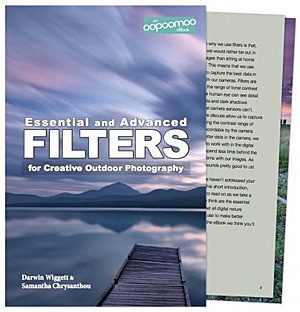
Essential and Advanced Filters for Creative and Outdoor Photography — E-book Review

A few months ago Dar­win Wiggett and Saman­tha Crysan­thou Pub­lished an e-book called Essen­tial and Advanced Fil­ters for Cre­ative and Out­door Pho­tog­ra­phy.  You may think that with dig­i­tal pho­tog­ra­phy the need for fil­ters is over and you would be mis­taken in think­ing this.

Cer­tain fil­ters like the polar­iz­ing fil­ter are essen­tial and at the time of this writ­ing, the effect of this fil­ter (which stays on my lens 95% of the time that I shoot out­doors in the day) is best achieved with an actual fil­ter on the lens. Although I have seen digital-effect polar­iz­ing fil­ters that you apply when post-processing an image, they suck when com­pared to the real thing. Dar­win and Saman­tha pro­vide awe­somely clear images and expla­na­tions as to why this fil­ter is essen­tial, how and when to use it cre­atively and when not to use it. This fil­ter is so impor­tant that a good 20% of the book is devoted to it. This sec­tion alone is worth the 10 dol­lars that they are charg­ing for the e-book.

Two other kinds of essen­tial fil­ters that Dar­win and Saman­tha talk about a great deal are grad­u­ated neu­tral den­sity fil­ters and neu­tral den­sity fil­ters. The pur­pose of grad­u­ated neu­tral den­sity fil­ters is to reduce the con­trast in a scene (like a clipped sky) because when a scene is too con­trasty the cam­era can not record all the tones even though our eye may see them. The fil­ters are nor­mally made of glass or plas­tic and are usu­ally shaded at one end and clear at the other end. Neu­tral den­sity fil­ters are solid coloured and are mainly used to make shut­ter speeds longer to achieve cre­ative blur­ring effects. This sec­tion of the book also has awe­some (fil­tered and non-filtered for com­par­i­son) images and crys­tal clear expla­na­tions on how to use these filters.

The final sec­tion of the book is ded­i­cated to addi­tional fil­ters that can add pop to your images as well as talk­ing about tech­ni­cal con­sid­er­a­tions like colour casts and noise reduction.

This e-book is fab and well worth the ten dol­lars. The only thing I might debate in this book is call­ing the neu­tral grad fil­ters essen­tial. I feel they are essen­tial only in cer­tain very impor­tant  cases. They are essen­tial if you want to spend less time in front of your com­puter post-processing your images, because your images will already have the con­trast con­trol built into the expo­sure. If you are already excel­lent at the HDR tech­nique, (tak­ing mul­ti­ple frames of the iden­ti­cal image with dif­fer­ent expo­sures and then blend­ing them in soft­ware) then these fil­ters are not essen­tial because you can achieve a sim­i­lar goal using HDR. That said, even if you know the HDR tech­nique well, grad­u­ated neu­tral den­sity fil­ters are still use­ful (per­haps even essen­tial) when the scene is con­trasty and involves movement.

It may come as no sur­prise that I highly rec­om­mend this 65 page e-book. Dar­win and Saman­tha are vet­eran pho­tog­ra­phers and teach­ers, write super-clearly and their pics really illus­trate the cre­ative effect these fil­ters have. This is an easy read with an easy on the eyes design. It’s a great e-book to have with you on your smart­phone or tablet for cre­ative inspi­ra­tion while in the field. It’s also a fab resource when you are think­ing about which of these fil­ters to buy.

This book can be pur­chased directly from Dar­win and Sam’s site. 

Photography forum image of the month – May 2012

Every month on our pho­tog­ra­phy forum mem­bers nom­i­nate images that they like. Then at the end of the month I choose an excel­lent image and talk about why it rocks. The photo I choose is not nec­es­sar­ily the best one of the month. I’ve come to real­ize it’s not really log­i­cal to pit images from totally dif­fer­ent gen­res against each other. That’s why there are cat­e­gories in photo con­tests. I just choose a photo that has extremely strong ele­ments that we can learn from.

Male RTH Hummingbird by Mike Bons

Male RTH Hum­ming­bird by Mike Bons

This month’s choice is Male RTH Hum­ming­bird Mike Bons

I chose this image for sev­eral reasons:

Com­po­si­tion — The com­po­si­tion here is very pleas­ing. The bird’s eye lines up on right near one of the lines of the thirds which is visu­ally inter­est­ing. The plant and the bird are cap­tured on a diag­o­nal which is also visu­ally inter­est­ing. Bright­ness is very well han­dled here and I find no dis­trac­tions that bother me.

Colour — What a rich pleas­ing colour palette used here. The colours of the bird and the flower even seem to match. Reds in the flower might be a hint too bright and over­sat­u­rated for me, but I can eas­ily live with it.

Sharp­ness — I love how sharp the bird is here (espe­cially the eye and the beak) ver­sus the out of focus back­ground, it totally pops.

Exposure/lighting — Again both are well han­dled. The com­bi­na­tion of flash and ambi­ent light is what is freez­ing the bird in mid-feeding here. I like how the bird is well lit with­out being ‘over-lit’ by the flash.

For all these rea­sons, this is my choice for image of the month. Since we all have opin­ions, some mem­bers may dis­agree with my choice. That’s cool but THIS thread is not the place for debate over my pick, NOR is it the place to fur­ther cri­tique the image. The pur­pose here is to sug­gest strong ele­ments in the photo that we may learn from.

Con­grats again Mike Bons for cap­tur­ing this lit­tle beauty.

F-16 Isn’t Magic

I’ve been giv­ing photo courses lately and I’m com­ing across a few points that peo­ple are reg­u­larly hav­ing trou­ble with. The lim­its of depth of field (or how sharp objects should be in gen­eral) is one of the things that many pho­tog­ra­phers don’t com­pre­hend. This is often because they are aware of only one of the three fac­tors that deter­mine depth of field, namely the aper­ture. Many of us know that when we use a small aper­ture we get good sharp­ness from fore­ground to back­ground ver­sus large aper­tures. But this is true only up to a cer­tain point because two other fac­tors are miss­ing.  A small aper­ture like F-16 isn’t a magic one that will give you great sharp­ness from fore­ground to back­ground in all cases.

Take the fol­low­ing image called Rust for exam­ple. It was cre­ated by Crash­cat from our forum for our monthly assign­ment called - June 2012 — f16 or smaller– Shoot­ing with a small aper­ture. Thx Crash­cat for the use of this image.


This image was shot at ISO 1600 f/16 at 1/20 using a 105mm lens.
As we can clearly see the depth of field here is shal­low and this is because there are two other fac­tors besides the cho­sen aper­ture that influ­ence depth of field. These fac­tors include the dis­tance from the object we are pho­tograph­ing and the focal length we use.  As we  approach an object, depth of field dimin­ishes. The longer the lens we use the less depth of field we will have ver­sus using a shorter one.

The image we are look­ing at is a macro image and so the cam­era is very close to the object. Had the cam­era been far­ther way, we’d see more sharp­ness from the top of the screw to the bot­tom of the screw. Not tons more sharp­ness mind you, but more. The side effect is that the screw wouldn’t have the mag­ni­fi­ca­tion that it does and would look less ‘close-up’.

Had this lens been wider, we’d also see a small increase in sharp­ness from the top of the screw to the bot­tom of the screw, but again the screw’s per­spec­tive would seem smaller.

There is no easy answer here. It’s just a mat­ter of prac­tis­ing and know­ing what to expect.

For those that are look­ing for fab­u­lous pre­ci­sion, feel free to use a depth of field cal­cu­la­tor which will show you the depth of field you can expect under any shoot­ing condition.


Sneak peek invitation — New personal work by Marko Kulik

Hi every­one!

I’m Marko, the owner admin of the Photography.ca web­site. Nor­mally when I post from the Photography.ca blog it is to pub­lish a pod­cast, an image of the month or to fea­ture pho­tographs from dif­fer­ent pho­tog­ra­phers. This post though is to invite you to see some new work that I have pub­lished on a new per­sonal site called markokulik.com.

One of the rea­sons I started this new site is because I feel this Photography.ca web­site is devoted to the pho­tog­ra­phy com­mu­nity at large and not my own per­sonal work. But I have been shoot­ing A LOT of per­sonal work lately and wanted to fea­ture the work in 1 place. In par­tic­u­lar, I have been pho­tograph­ing cities at night using inten­tional cam­era move­ment and long expo­sures. You can see those images in the new gallery called Impres­sion­is­tic Cities at Night. This is an ongo­ing project, and I will talk about and post new pho­tos to that gallery reg­u­larly. I also intend to upload and talk about older work.

Although I almost never ask for favors.….I have a favor to ask if you enjoy my work. Please go to any page on markokulik.com and enter your email address at the top of any page to sub­scribe to updates. These updates will talk mainly about the work being pro­duced and I will never sell, trade, share or pimp out your per­sonal infor­ma­tion in any way. You can can­cel at any­time. Thanks so much in advance and here is a peek at the open­ing image on the site. Thanks again, Sin­cerely — Marko Kulik

Carré Jacques Cartier - Montréal by Marko Kulik

Carré Jacques Cartier — Mon­tréal by Marko Kulik


Photography forum image of the month December 2011

Every month on our pho­tog­ra­phy forum mem­bers nom­i­nate images that they like. Then at the end of the month I choose an excel­lent image and talk about why it rocks. The photo I choose is not nec­es­sar­ily the best one of the month. I’ve come to real­ize it’s not really log­i­cal to pit images from totally dif­fer­ent gen­res against each other. That’s why there are cat­e­gories in photo con­tests. I just choose a photo that has extremely strong ele­ments that we can learn from.

The Peace Bridge - At Last!  by JAS_Photo

The Peace Bridge — At Last! by JAS_Photo

This month’s choice is (click to see the larger ver­sion of this image)  The Peace Bridge — At Last! by JAS_Photo

I chose this image for sev­eral reasons:

1 — Com­po­si­tion — This is a very strong com­po­si­tion and the bridge itself acts as a fan­tas­tic lead­ing line. It guides our eye beau­ti­fully into the image. In addi­tion, aside from the shape of the bridge itself, there are also other “mini-shapes” in the bridge itself as well as all around the image. These other mini-shapes add a lot of inter­est to the image.

2 — Tones and post pro­cess­ing — The bridge itself is selec­tively coloured in this image and I like that very much in this case. I feel it works and offers a new take on what is likely a heav­ily pho­tographed piece of infra-structure. For me it sug­gests ‘some­thing new’ being intro­duced into a city. The desat­u­ra­tion of the back­ground com­pli­ments the bridge and really makes the bridge pop.

3 — Story and per­spec­tive — This bridge is still a work in progress and we can see a crane in the back­ground that sug­gests this. We see the bridge “mov­ing” toward the back­ground which sug­gests to me some­thing new being intro­duced to some­thing older. The angle or per­spec­tive from which the image was taken was very well cho­sen to sug­gest this story.

For all these rea­sons, this is my choice for image of the month. Since we all have opin­ions, some mem­bers may dis­agree with my choice. That’s cool but THIS thread is not the place for debate over my pick, NOR is it the place to fur­ther cri­tique the image. The pur­pose here is to sug­gest strong ele­ments in the photo that we may learn from.

Con­grats again JAS_Photo for cre­at­ing this won­der­ful image!


Photography forum image of the month November 2011

Every month on our pho­tog­ra­phy forum mem­bers nom­i­nate images that they like. Then at the end of the month I choose an excel­lent image and talk about why it rocks. The photo I choose is not nec­es­sar­ily the best one of the month. I’ve come to real­ize it’s not really log­i­cal to pit images from totally dif­fer­ent gen­res against each other. That’s why there are cat­e­gories in photo con­tests. I just choose a photo that has extremely strong ele­ments that we can learn from.

Fight Club! by Lizardqing

Fight Club! by Lizardqing


This month’s choice is (click to see the larger ver­sion of this image) Fight Club! by Lizardqing

I chose this image for sev­eral reasons:

1 — Timing/Decisive moment. You gotta have a quick trig­ger fin­ger to catch a moment like this or you will miss it. We’ve all missed fab oppor­tu­ni­ties like this, or mis­framed oppor­tu­ni­ties like this; good on Lizardquing for this fab capture.

2 — Com­po­si­tion — I really like the com­po­si­tion here. It is espe­cially impres­sive given the speed needed to catch this image. I really like the faun at the right side as well as the posi­tion of the trees.

3 — Exposure/lighting/colour — Expo­sure looks very good here and could eas­ily have been missed given the light­ing. Good choice of shutter-speed to keep things fairly sharp but still reveal motion in the deers’ front legs. Lovely colour palette as well. The light­ing is won­der­ful in this image, good on Lizardqing for being there early enough to capture.

For all these rea­sons, this is my choice for image of the month. Since we all have opin­ions, some mem­bers may dis­agree with my choice. That’s cool but THIS thread is not the place for debate over my pick, NOR is it the place to fur­ther cri­tique the image. The pur­pose here is to sug­gest strong ele­ments in the photo that we may learn from.

Con­grats again Lizardqing for cap­tur­ing this won­der­ful moment!

Photography forum image of the month October 2011

Every month on our pho­tog­ra­phy forum mem­bers nom­i­nate images that they like. Then at the end of the month I choose an excel­lent image and talk about why it rocks. The photo I choose is not nec­es­sar­ily the best one of the month. I’ve come to real­ize it’s not really log­i­cal to pit images from totally dif­fer­ent gen­res against each other. That’s why there are cat­e­gories in photo con­tests. I just choose a photo that has extremely strong ele­ments that we can learn from.

Autumn Web by Richard

Autumn Web by Richard

This month’s choice is (click to see the larger ver­sion of this image)  Autumn Web by Richard

I chose this image for sev­eral reasons:

1 — Plan­ning and exe­cu­tion — This strik­ing image is the result of plan­ning, it didn’t “just hap­pen” and it wasn’t a quick snap. The light­ing, comp and post-processing are all well thought out here. The result is a strik­ing moody fall image.

2 — Com­po­si­tion — details — post­pro­cess­ing — Lovely ren­dered details like the spi­der as well as the spider’s web all con­tribute to the com­po­si­tion here. Spi­der is framed nicely between the red leaves and against the back­light. The post­pro­cess­ing includ­ing the vignette and pos­si­ble selec­tive sharp­en­ing are guid­ing our eyes thought­fully with­out distractions.

3 — Light­ing — Mood — Back­light­ing is a chal­leng­ing light to deal with, but Richard bal­ances it well with off cam­era flash. The end result is an image with a lovely mood that would likely have felt too dark with­out the added light.

4 — Selec­tive focus — A wide aper­ture is well used here to get the dreamy back­ground bokeh. It adds another ‘layer’ to the image.

For all these rea­sons, this is my choice for image of the month. Since we all have opin­ions, some mem­bers may dis­agree with my choice. That’s cool but THIS thread is not the place for debate over my pick, NOR is it the place to fur­ther cri­tique the image. The pur­pose here is to sug­gest strong ele­ments in the photo that we may learn from.

Con­grats again Richard for cre­at­ing this strik­ing image!

Mois De La Photo in Montreal 2011 — First Impressions

This Sat­ur­day I spent about 3–4 hours going to dif­fer­ent exhi­bi­tions that make up Mois De La Photo (Photo Month) in Mon­treal. I’m not fond of writ­ing about things I don’t like, I MUCH pre­fer to select a few things that I do like and write about those.

I was dis­ap­pointed in the work that I saw over­all. I saw about 8–10 exhi­bi­tions and I won’t name them. It wasn’t because the work was bad or any­thing, it just was not my cup of tea. Almost every­thing I saw was dark-themed, abstract, overly-intellectualized, and WAY too exper­i­men­tal imo. I have noth­ing against exper­i­men­tal, but imag­ine if 99% of every­thing you heard at the Mon­treal Jazz fest was experimental.…it would suck for most peo­ple. Peo­ple expect fes­ti­vals that they go to, to some­what rep­re­sent their idea of what the fes­ti­val is about. Of the 8 Exhi­bi­tions, 3 of them had videos…Video is not pho­tog­ra­phy. I DO have an open mind BTW; I guess I just would have liked even a teeny rep­re­sen­ta­tion of the work that I saw to be sim­i­lar to the fine art pho­tog­ra­phy that I like to see.

So at the end of the day, I guess my issue is with the Title, “Mois de la photo”. Such a con­ven­tional title, it makes you think you will be see­ing ‘some’ con­ven­tional pho­tog­ra­phy. You will not (as far as I can tell from my sam­ple). I’d much rather they title the thing Exper­i­men­tal photo Month.

Of the 8 exhi­bi­tions I saw, the only one I liked a bit was The Dead by Jack Bur­man. Large prints of dead peo­ple pre­served in formalde­hyde. Not try­ing to be face­tious here, but Burman’s exhi­bi­tion was one of the most con­crete, and “acces­si­ble” ones. You know full well what you are look­ing at.

Image from ‘The Dead’ by Jack Burman

Photography forum image of the month August 2011

Every month on our pho­tog­ra­phy forum mem­bers nom­i­nate images that they like. Then at the end of the month I choose an excel­lent image and talk about why it rocks. The photo I choose is not nec­es­sar­ily the best one of the month. I’ve come to real­ize it’s not really log­i­cal to pit images from totally dif­fer­ent gen­res against each other. That’s why there are cat­e­gories in photo con­tests. I just choose a photo that has extremely strong ele­ments that we can learn from.

My Lit­tle Friend by Wicked Dark

This Month’s choice is  (click to see the large ver­sion of this image) My Lit­tle Friend by Wicked Dark.

I chose this image for sev­eral reasons:

Sharp­ness — It’s dif­fi­cult to get this level of sharp­ness when doing macro work and the sharp­ness on the crawler here is won­der­ful and very strik­ing! On the oppo­site end the back­ground out of focus ele­ments also work well to iso­late the pri­mary subject.

Com­po­si­tion — All eyes are on the bug here and this is due to good com­po­si­tion with almost no dis­trac­tions. The curved part of the crawler is well seen due to the comp and the diag­o­nal branch at right act as a frame and helps keep our eyes on the most impor­tant element.

Colour/Lighting — The image busts with colour due to shoot­ing in softer light along with some (likely) pro­cess­ing to enhance the greens.

For all these rea­sons, this is my choice for image of the month. Since we all have opin­ions, some mem­bers may dis­agree with my choice. That’s cool but THIS thread is not the place for debate over my pick, NOR is it the place to fur­ther cri­tique the image. The pur­pose here is to sug­gest strong ele­ments in the photo that we may learn from.

Con­grats again Wicked Dark for cap­tur­ing this strik­ing crawler.

Photography forum image of the month July 2011

Every month on our pho­tog­ra­phy forum mem­bers nom­i­nate images that they like. Then at the end of the month I choose an excel­lent image and talk about why it rocks. The photo I choose is not nec­es­sar­ily the best one of the month. I’ve come to real­ize it’s not really log­i­cal to pit images from totally dif­fer­ent gen­res against each other. That’s why there are cat­e­gories in photo con­tests. I just choose a photo that has extremely strong ele­ments that we can learn from.

Today’s Calla Lil­lies by Ernst Ulrich-Schafer

This month’s choice is Today’s Calla Lil­lies by Ernst Ulrich-Schafer.

I chose this image for sev­eral reasons:

Com­po­si­tion — Com­po­si­tion here is very pleas­ing to the eye! Diag­o­nal stems from bot­tom left guide the eye to the focal point of the image which are the flow­ers’ inte­ri­ors. The shapes of the flow­ers them­selves are won­der­ful and won­der­fully placed in the image. The flow­ers even cre­ate quite an inter­est­ing neg­a­tive space due the con­trast against a black background.

Light­ing and Post-processing — Lovely light­ing here shows off the flow­ers very well. The light­ing is soft­ish but doesn’t look over­soft. Shad­ows are well con­trolled here with the deep­est blacks being the back­ground itself. This helps the flow­ers “pop” big-time against that back­ground. Post-processing is also well done here with lovely details in the whites. If I have one nit, I’d nix the black frame as this changes the over­all per­spec­tive of the flow­ers mak­ing them look smaller. That said, I know Ernst put it there 100% on pur­pose and it works for him.

Tonal qual­ity — I really like the mono­chrome (light sepia to my eye) qual­ity of this image. Mono­chrome really helps show off the strong shapes of these flow­ers, as well as give them a nos­tal­gic feel.

For all these rea­sons, this is my choice for image of the month. Since we all have opin­ions, some mem­bers may dis­agree with my choice. That’s cool but THIS thread is not the place for debate over my pick, NOR is it the place to fur­ther cri­tique the image. The pur­pose here is to sug­gest strong ele­ments in the photo that we may learn from.

Con­grats again Ernst Ulrich-Schafer for cre­at­ing this won­der­ful image!

Watch Your Backgrounds by Kristen Smith

Watch­ing what is going on in the back­ground is use­ful advice, not only for cops in urban shoot-outs, but also for close up and macro pho­tog­ra­phers.  Because bokeh and depth of field are such promi­nent aspects of these types of shots, you really have to watch the back­ground to make sure it com­ple­ments your sub­ject and doesn’t com­pete with it.  Some­times I get so focused on the sub­ject itself that the back­ground just fades away.  And because often times a sub­ject is far away from the back­ground, things just don’t get noticed.

With this shot, I was so intensely involved with the flow­ers that I didn’t really “see” my back­pack which was about 4 feet away and clearly in view.  I really needed to stop and look at the whole scene, but I didn’t.  Some­times it can take a few min­utes to set­tle into the groove and start prac­tic­ing good habits and by the time I got dili­gent, it was too late for this one.

Pho­to­graph by Kris­ten Smith

In addi­tion to watch­ing the far back­ground, keep an eye out for stray items close to the sub­ject that might dis­tract the eye.  So many times I get my pic­tures home only to find some annoy­ing leaf, pine nee­dle or branch.  Ugh.  I find that using Live View not only makes tak­ing the photo eas­ier, but gives you a 2D image to look at right away. Many times I catch bad com­po­si­tional ele­ments this way.  Check out this series of shots that illus­trate how I cleaned up my shot –

Pho­to­graph by Kris­ten Smith

Hmm that back­ground doesn’t do the flower any favors, does it?  I need to make the flower really pop out of the bokeh, not just sit there in it.  That stump has got to go. Luck­ily at this mag­ni­fi­ca­tion and per­spec­tive, very small move­ments make for very big changes.

Pho­to­graph by Kris­ten Smith

I barely moved my cam­era, but the dif­fer­ence in back­ground works so much bet­ter.  But this time I notice two things – one, there’s a lot of light play­ing the back­drop and I have to time the shot right so that it is more uni­form back there and there aren’t any hot spots to detract from the flow­ers, two, there are a few stray pine nee­dles and that leaf in the bot­tom right isn’t con­tribut­ing any­thing good.  I pluck those out of the way and lo and behold there’s moss under that leaf and when I judge the light to be the best — Presto!

Pho­to­graph by Kris­ten Smith

So as you can see, the process can take a few steps to get a use­able image.  The key is to develop good habits.

  1. Stop and look at the whole scene, back­ground and fore­ground and eval­u­ate each aspect includ­ing the light if it’s variable
  2. Remove dis­tract­ing things like sticks and leaves
  3. Change cam­era posi­tion for more har­mo­nious back­grounds and foregrounds
  4. Use Live View to see how the 3D trans­lates to 2D

Hope­fully this helps you in the field the next time you’re doing close-up and macro work.  Got any to share?  Feel free to log in to the Photography.ca forum and start a thread.

For more of Kristen’s out­door pho­tog­ra­phy and other arti­cles visit wickeddarkphotography.com

Photography forum image of the month June 2011

Every month on our pho­tog­ra­phy forum mem­bers nom­i­nate images that they like. Then at the end of the month I choose an excel­lent image and talk about why it rocks. The photo I choose is not nec­es­sar­ily the best one of the month. I’ve come to real­ize it’s not really log­i­cal to pit images from totally dif­fer­ent gen­res against each other. That’s why there are cat­e­gories in photo con­tests. I just choose a photo that has extremely strong ele­ments that we can learn from.

Flower Pick­ing at Ast­bury Mere by Richard

This month’s choice is Flower Pick­ing at Ast­bury Mere by Richard

I chose this image for sev­eral reasons:

Gesture/Mood — The over­all ‘ges­ture’ is beau­ti­fully cap­tured in this image. Richard cap­tured his daugh­ter in mid-step while walk­ing through nature play­ing with a leaf and a flower. It feels as though she may have been day­dream­ing; in fact the whole image has a day­dreamy qual­ity due in good part to the ‘ges­ture’ and won­der­ful backlighting.

Post-Processing — The (PP) post-processing here works very well to sup­port the image. I really like the vignetting all around the girl as it empha­sizes the girl’s walk through a field of flow­ers and sunshine.

Selec­tive focus — Shal­low depth of field is clas­si­cally used to have the girl stand out against the dreamy background.

Lighting/exposure — Back­light­ing was well cho­sen here as the light is quite harsh but the image doesn’t have a very harsh feel. The girl’s face looks well exposed and appears com­fort­able and nat­ural because the sun is not blast­ing it directly. The spec­u­lar high­lights on the hair, hand and around the cloth­ing are won­der­ful warm accents and do not distract.

For all these rea­sons, this is my choice for image of the month. Since we all have opin­ions, some mem­bers may dis­agree with my choice. That’s cool but THIS thread is not the place for debate over my pick, NOR is it the place to fur­ther cri­tique the image. The pur­pose here is to sug­gest strong ele­ments in the photo that we may learn from.

Con­grats again Richard for see­ing and cap­tur­ing this won­der­ful photo!