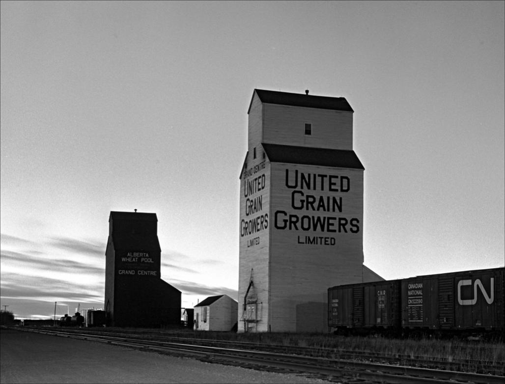
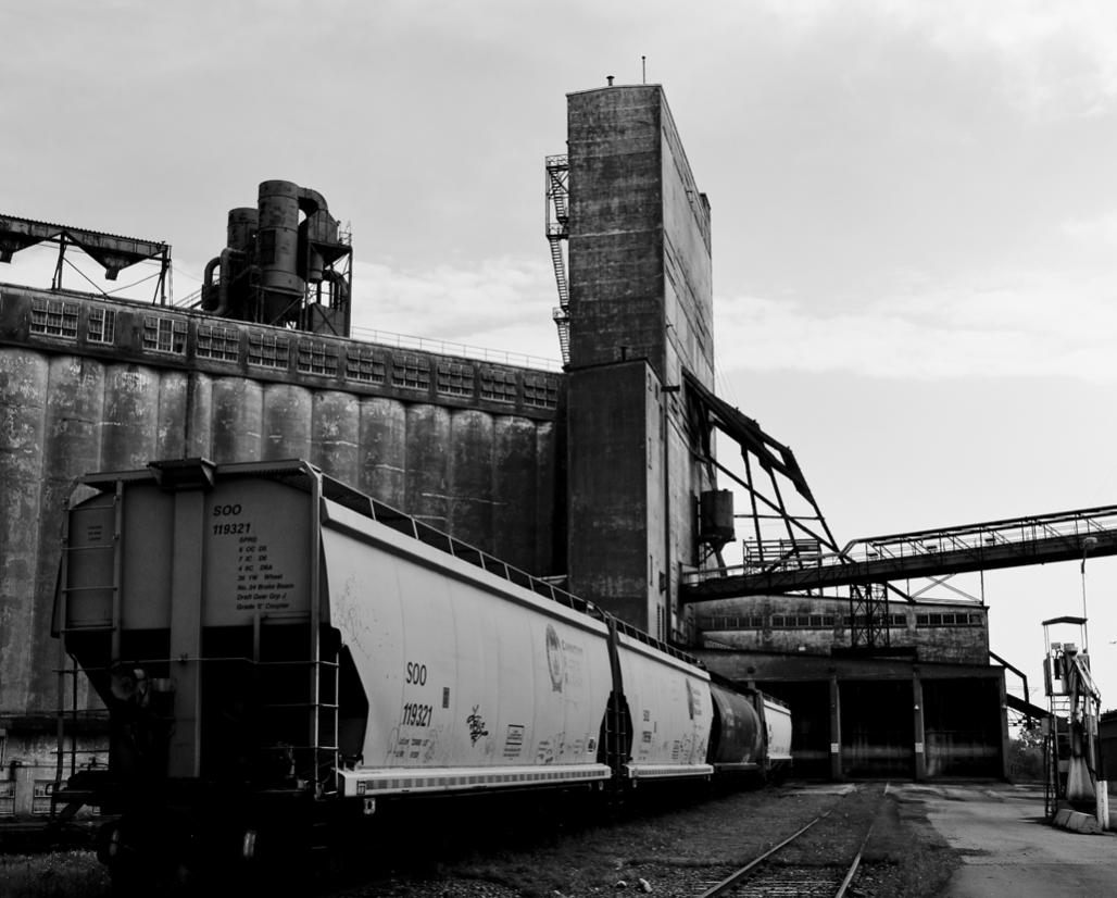
Attachment 17470Attachment 17471The Alberta grain elevator is from a 4x5 b&w neg. The Johnstown elevator on the St. Lawrence is digital, converted to b&w.
Printable View
Attachment 17470Attachment 17471The Alberta grain elevator is from a 4x5 b&w neg. The Johnstown elevator on the St. Lawrence is digital, converted to b&w.
I'm all over the 2nd one..great perspective.
Thank you for comments. Jim
Really like the processing of the 2nd one as well.
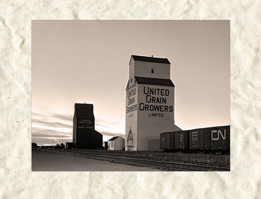
I like these Bws and they might also look really cool in sepia.
Attachment 17541Attachment 17540Marko, sepia toning - good idea. Also, as some one mentioned, I also like your street photography, It's a genre I miss doing.
Sepia is such a hard colour to pin down sometimes. For me this is the colour sepia is closer to this Sepia - Color Sorting
Your sepia looks a little pink to me though (versus brownish)
That said - i quite like these redos Jim, especially shot 2!
I love the 2nd shot - such wonderful detail and terrific composition. Very dynamic. I think I'd prefer the original over sepia. Lovely image.
Doug L, Marko - thanks for comments. I agree the sepia is a bit off. I used CS-4 Adobe's "Sepia", possibly one of the warming filters would have done a better job. If one was printing sepia prints, the best approach might be to read the R,G,B values, and use them - once a good sepia tone is pinned down. I like the Alberta shot (United Grain) in sepia, but prefer the other one as a B&W.
Agreed. Very well seen and taken Jim.Quote:
Originally Posted by casil403