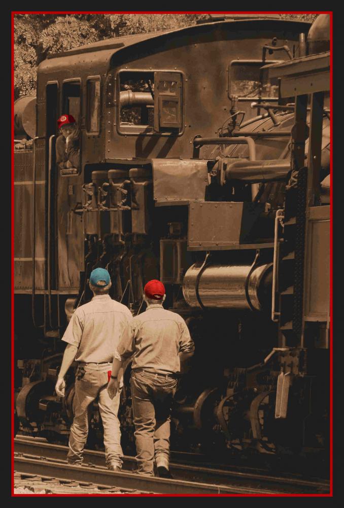
I am calling this "Consultation" because this scenic steam engine rail road ride had a break midway on the trip...the brakemen approached the conductor to have a mid trip consultation.
Attachment 502
Printable View
I am calling this "Consultation" because this scenic steam engine rail road ride had a break midway on the trip...the brakemen approached the conductor to have a mid trip consultation.
Attachment 502
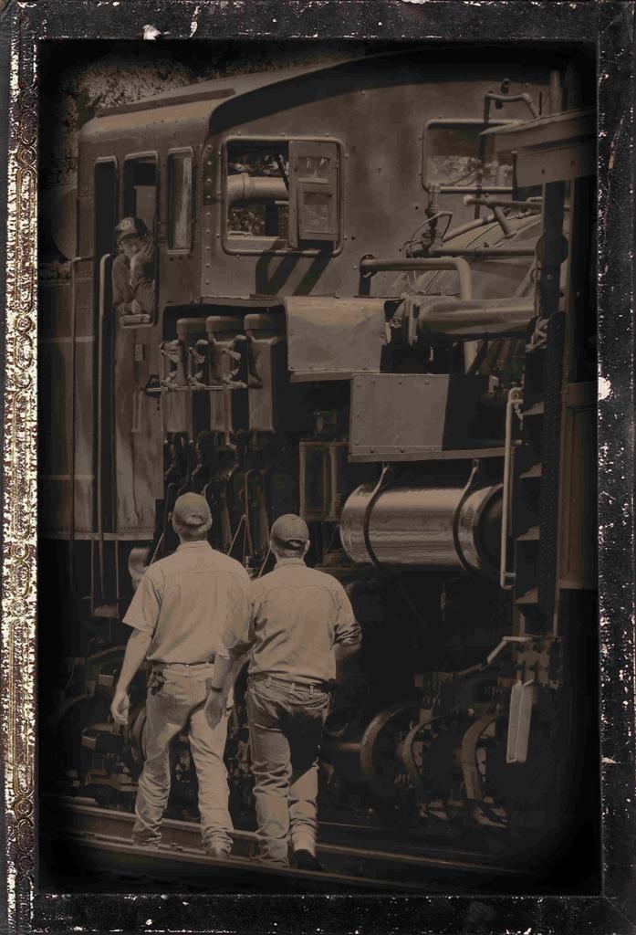
This time with time machine
Attachment 504
I like these shots tomorrowstreasures:)
shot 1 - I like the sepia colour in this shot and feel it adds to the mood. I'm not convinced the shot needs the coloured hats. I think I see why you did it (modern man colour - old train monotone) but I'd love to see them without the hats to compare. I bet the shot stands on its own quite well as is shown by the other shot. Either way, the red border does seem to work with the hats. Even though many people feel it's a dated techinique, I love handpainting (actually painting on a print) and computer handpainting (selectively colouring portions in a computer image). Something seems to draw me to these images so I'm glad to see you trying it out. :highfive:
Shot 2 - I'm not exactly sure what time machine refers to?
Either way - I like this version as well, I prefer it to shot 1. I like the muted tones a wee bit of brown colour. I might play with lightening the face of the guy in the train by maybe 5-10%. Aside from that I dig it. Borders too.
Hope that helps,
marko
Agree with marko - great shots. That's Mayo #3, right?
REALLY nice texture on that train!
Tiredron: these are coal/steam engines in Cass, West Virginia, US... this is
Engine #11
Thank you for such kind reviews! On my to do list is to continue playing with the images I submit ....
Marko-
The time machine was in reference to the filter i used on pspx2
I love trying new techniques - I am not so sure I like the hats colored either. The brush I used was a water color brush, I wanted to be able to see the shading beneath the paint, but, the paint went on vivid and not in the muted tones that i loaded...again, an experiment.
The 2nd one i like better too. I agree that his face needs lightening up.
Thank you so much for taking the time to give your opinion!:)
Quote:
Originally Posted by marko
There is no Cass #11 AFAIK... :confused:Quote:
Originally Posted by tomorrowstreasures
Edit: Yup, a quick check of their 'site reveals Shays 2, 3, 4, 5, 6, 7. Very hard to tell from the cab only, but that looks like an 80 ton; could it be #7?
Here you go, tiredron... I don't know any thing about trains, so I thought i would upload this to help you out.
Attachment 513
Okay, got it now. Took a little digging; they've renumbered their 90 ton, formerly Feather River #3. Wasn't doubting you; just didn't make sense based on what I knew.
Thanks - and if you've got any more Cass images, I'd love to see them (or any railroad images at all for that matter)
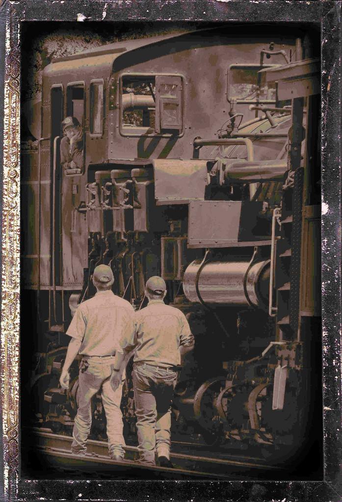
here goes... The previous version and the tinkered version....i like the lighter version, how about you?
Attachment 521
Attachment 522[
QUOTE=marko;4454]I like these shots tomorrowstreasures:)
shot 1 - I like the sepia colour in this shot and feel it adds to the mood. I'm not convinced the shot needs the coloured hats. I think I see why you did it (modern man colour - old train monotone) but I'd love to see them without the hats to compare. I bet the shot stands on its own quite well as is shown by the other shot. Either way, the red border does seem to work with the hats. Even though many people feel it's a dated techinique, I love handpainting (actually painting on a print) and computer handpainting (selectively colouring portions in a computer image). Something seems to draw me to these images so I'm glad to see you trying it out. :highfive:
Shot 2 - I'm not exactly sure what time machine refers to?
Either way - I like this version as well, I prefer it to shot 1. I like the muted tones a wee bit of brown colour. I might play with lightening the face of the guy in the train by maybe 5-10%. Aside from that I dig it. Borders too.
Hope that helps,
marko[/QUOTE]
Now we are getting into personal taste.
Just so it's clear I'm referring to the last post # 11
I prefer the first shot. The only thing I like better in that second shot is the lightening of the driver's face. I realize that I'm bucking the whole wide range of tones dogma - but some shots can occasionally break the rules. Given the unconventional nature of the shot I feel the rules can be broken here.
For me, the first shot has a much more interesting 'mood' due to its darker tones....but we are getting into personal tastes here. Also shot 2 has many funky 'artifacts' and coloured shadings that detract from the image and its mood.
hope that helps,
marko
Hi! First time I have had a title named after me. :)
The first shot is much better than the second in bringing out the shapes and details in the structure of the train. Some selective work with the brightening brush in PaintShop Pro or dodging in Photoshop, I would recommend, particularly toward the bottom of the train.
Tegan
I will continue play with this image.... Thanks for the cc!!!! I can see the improvements, and appreciate the help so much!
Susan
Quote:
Originally Posted by tirediron
Hey tiredron... when I revisit the photo to rework, i will put together a file and email it to you...okay...susan:)
Thanks! :D I'll look forward to it.Quote:
Originally Posted by tomorrowstreasures
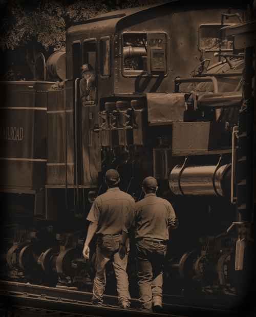
This submssion is after I lightened the conductor's face a bit....
Attachment 592
The top one for me... I like extremes on either end... either extreme contrast or no contrast.... I don't like to sit on the fence.
I just looked over all of them. I can't decide which one I favor. I like them all for different reasons and do not feel comfortable saying which one fits well technically. sigh.