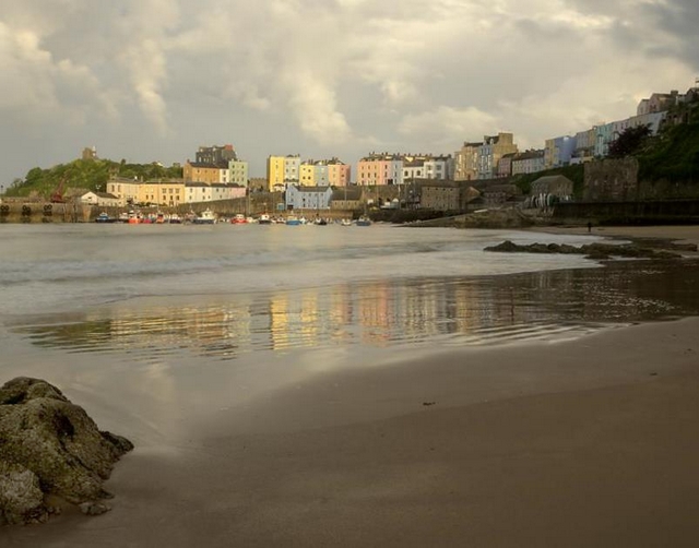
From a few weeks ago on a trip to West Wales, an evening visit to Tenby.
Comments welcome.
Taffy:)
Printable View
From a few weeks ago on a trip to West Wales, an evening visit to Tenby.
Comments welcome.
Taffy:)
Lovely light. I'd have liked to see that foreground rock a bit brighter. A bit of a dodge would do the trick.
You could maybe crop out or clone that bright spot in the sky as well.
This is a really cool scene and I love that you captured the reflections of the buildings in the beach. The foreground rock adds interest but as MA points out it could be a tad brighter. The thing that I notice is that it feels a little off balance to me. A few steps to the left and a turn to the right might made the difference. It feels like my eye falls off the end of the earth as I follow the line of buildings across the horizon and out into the void. I brightened up the foreground rock and cropped slightly differently. This is my interpretation...YMMV :)
Attachment 12408
Sorry Iggy but I thimk I prefer the original better. I think the picture should have more of a landscape orientation, your crop makes it more square. I really love the light in that picture.
I agree also. The original comp is much better imho ... the complete foreground rock is integral to the photo I beleiveQuote:
Originally Posted by asnow
I just think you could use a bit more details in the clouds and maybe a tad darker through the middle. Not enough depth to the colour on the houses. Just appear somewhat washed out.
No worries. I really like the rock too.. just trying to think outside the box :)
Lovely scene! I quite like the original crop but i agree that dodging the front rock a tad would be a plus.
Even though it's already quite bright - I think a bit more contrast play (5-10%) could make this sing just a touch louder.
Thanks for all the comments.
I have reworked the original in light of some of the comments.
Taffy:)
Just wondering if anyone thought my re-work was better?
taffy
I like it better!
Yes, very nice. I like the way the bridge tips off at the right side. I think it actually leads the eye into the photo.
I can see very little difference between the two. The last effort appears to have more yellow cast than the first which steals a little of the colour from the houses. I like the first better.
Agree with MA here, colours appear punchier on my monitor in the first shot - my vote goes for #1
Nice light and scene. I also prefer the original crop.
TBH apart from the fix to bright spot in the clouds I can't see much difference between the first version and your latest one. Yes the rock is brighter, but it hasn't made much difference to my eyes.
I agree with MA.Quote:
I can see very little difference between the two. The last effort appears to have more yellow cast than the first which steals a little of the colour from the houses. I like the first better