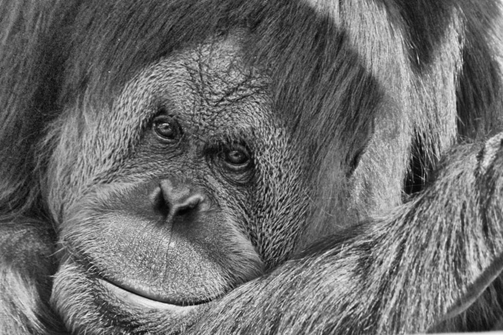
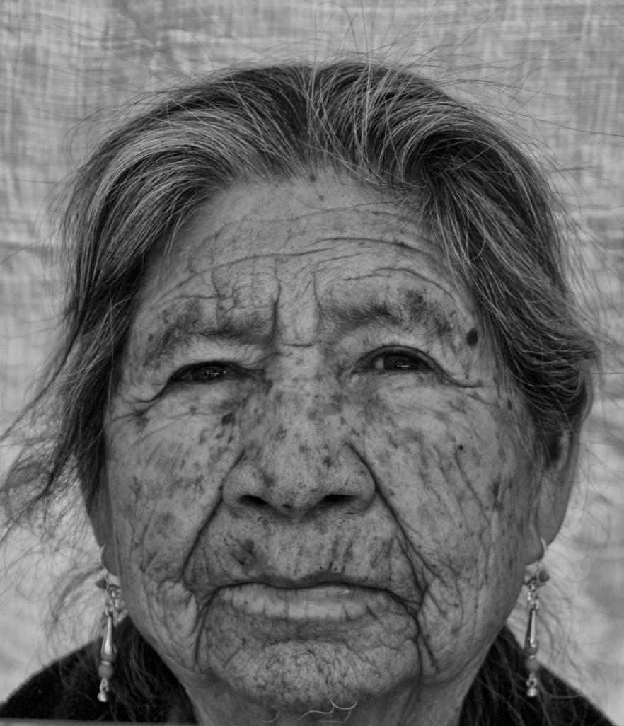
Attachment 15290Attachment 15291Hi! Kind of following up on a previous post (http://www.photography.ca/Forums/f7/...ved-17685.html) I'm attaching three shots for your valuable feedback.
Printable View
Attachment 15290Attachment 15291Hi! Kind of following up on a previous post (http://www.photography.ca/Forums/f7/...ved-17685.html) I'm attaching three shots for your valuable feedback.
No comments?
:(
slow day i guess!
I quite like the composition on the last image. The right crop could go in a tad I feel. The bird adds a lot! I also like the BW of that image.
I also like the 'silvery' quality of the first image. The crop I find is too tight on image 1 - the eyes could also be a wee bit sharper though it is a cute shot.
Image 2 is not doing much for me I'm afraid even though she has a great face.
For me, you went in too tight and cropped too tight, especially on the bottom. Her expression is also very flat. I think for that image i would have like to have seen a bit more of the environment.
Hope that helps - marko
Sure helps Marko, thank you. In the second shot I could not quite put my finger on what it was that I did not like, but you are right. I thought it was good because of the face but you make great points.
I'll try your suggested crop on the one with the bird.
My pleasure. For you or anyone reading this, sometimes I just get busy and miss threads and occasionally there are no comments.
If at anytime I miss a thread and you'd like me to take a look for any reason - please feel 100% to pm me. Or 'bump' the post and I'll make an even stronger effort to look and comment.
Thx!
I pretty much agree with Marko. Even though the crop in shot 1 is a little tight(at the bottom) I like it very much, so it it more a comment on how it could have been better.
Shot 2 is looks like the focus might be slightly more on the forehead than the eyes and the DOF either too shallow or too much.
I like the shot 3 for the bird and the comp except for the little extra bit of the building on the right, which could have been more or cropped off.
I like the B&W in all 3 images.
Marko and AntZ have covered the issues of the cropping, and composition - I would only add the #1 might be slightly over exposed, #2 is underexposed and #3 is just about dead on (on my monitor).