Haven't been out much, but I've been out.
Attachment 19225xxxxAttachment 19226
Attachment 19227
Printable View
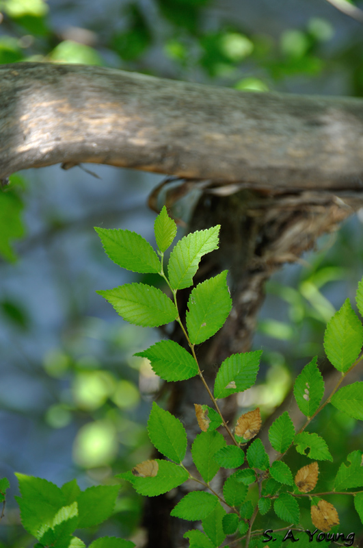
Haven't been out much, but I've been out.
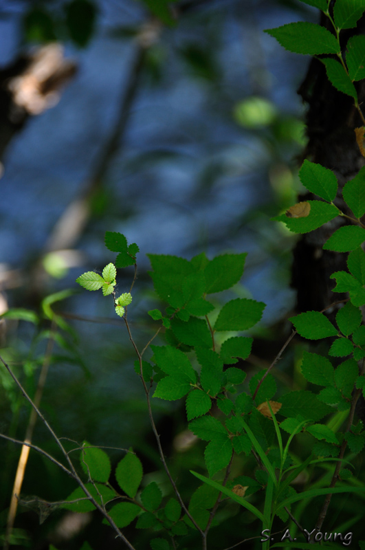
Attachment 19225xxxxAttachment 19226
Attachment 19227
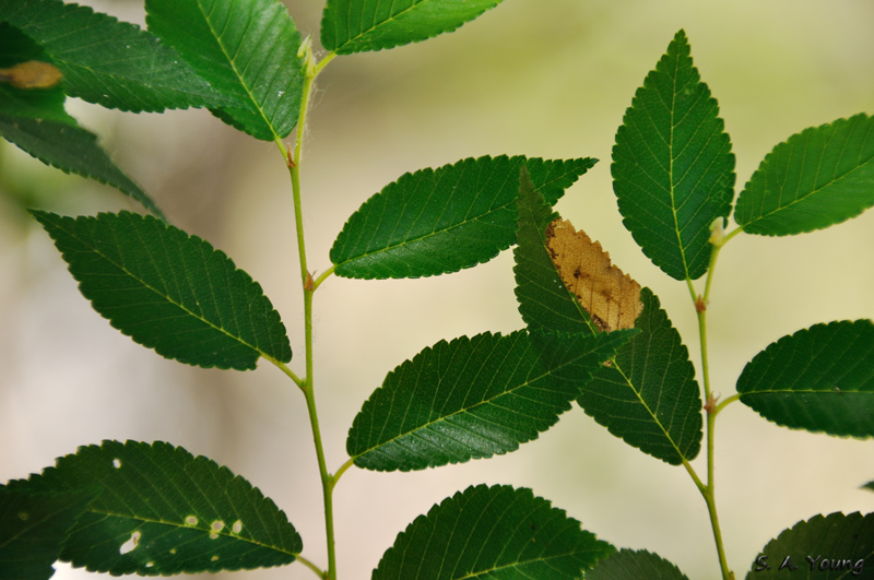
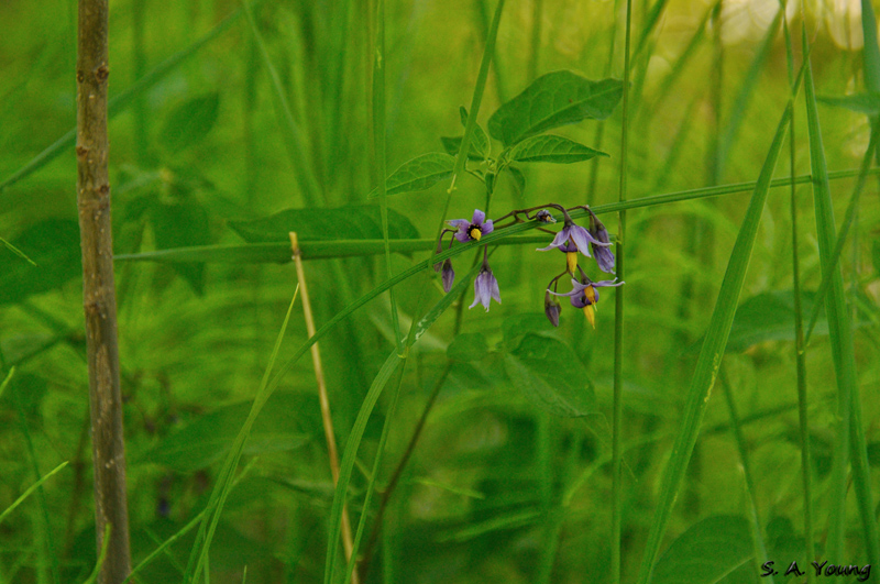
Attachment 19228
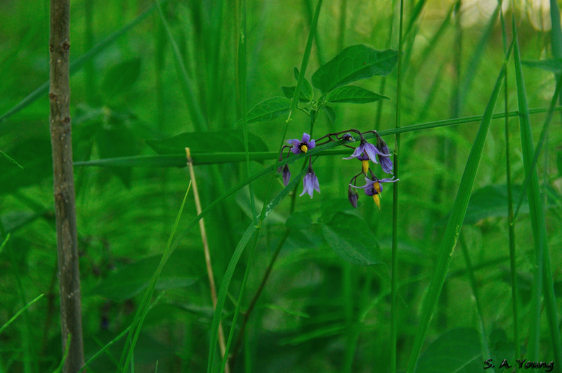
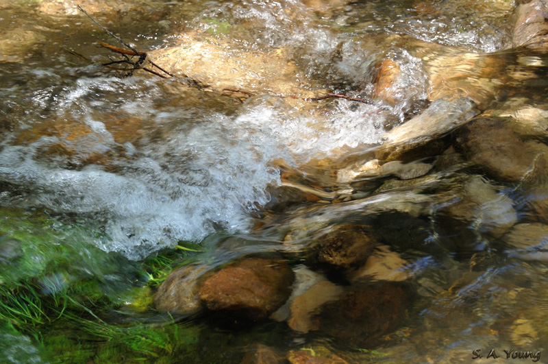
Attachment 19229
Actual color's a bit closer to the second one, but I do like the way nightshade looks when I let the colors run cool.
Attachment 19230
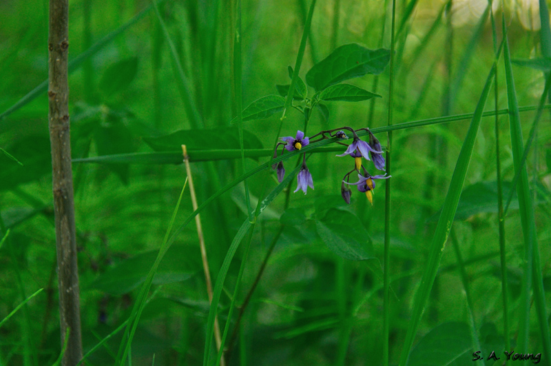
really dig shot 3 post 1 and shots 1 or 2 from post 2 which are my faves of the set and a superb composition imo.
I have a niggly small critique for that image - let me know if you'd like me to post it.
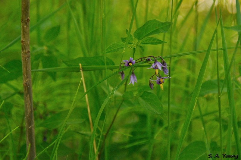
Sure, fire away. I fiddled with that one quite a bit - different crops, mostly. I thought the twig to the side was a bit hard to consider cloning out, so tried to minimize the distraction. What else?
Really likin' that second one of the Nightshade QO.
(maybe try a tight crop off left, right of the straw coloured vertical twig) just a thought?
Sure, for me the shot is nearly perfect as is...except the top right corner - 15% or so burn should do it.
a 5-10% dodge on the main flower would also add pop. Hope that may help.
HBG, I like the leaves above the flowers. I tried a couple of crops, including vertical, to try and keep them, and they didn't work as well as just leaving the straw and twig in. Marko, here's the results of your suggestion. I can see the difference (subtle), but can't tell if they need a little more.
Attachment 19339xxxAttachment 19340
.I really like the lighting on the few leaves in the top right one in first post. It really makes those few leaves pop
That's what attracted me to those leaves, asnow. Then I had to wait for the breeze to take a break so I could get 'em.