The World Press Photo is an International non profit organization that runs a prestigious contest that has been around since 1955. Every year they choose a winning photojournalistic image from among thousands of entries from different categories and name a single image as World Press Photo of the Year. Many of the past winning images are iconic photographs.
This year, the winning image called Gaza Burial by Paul Hansen has undergone a lot of controversy. Some are saying that the 2013 World Press photo of the year image is fake, that it is a composite image and should be disqualified. Others are saying that the image is not a composite image but is very manipulated. Another version of the same image has been discovered on Flickr which is only adding to this controversy.
World Press Photo denies that the image is a composite but agrees that it was retouched with respect to both global and local color and tone.
Welcome to the new photographic world where reality is subjectively massaged by the photographer, even in photojournalism. If you think that this should not be the case, in theory I’ll tell you that I agree with you.
I’ll also tell you that clinging to these purist notions gets you nowhere and that the vast majority of quality photographs that I see today, in any and all photography genres have been manipulated in some way.
Even classic photojournalistic images have been manipulated in the past. Tokomo Uemura in her Bath from the Minimata series by Eugene Smith was bleached for example to make the whites whiter. But that was a black and white photograph. The average person does not know how skin tones should render in black and white so these images were more subtle in their manipulation. Way easier to spot unnatural looking colours in colour photojournalism.
Photographers themselves are on the fence about what level of manipulation they feel is acceptable in Photojournalism. Even for World Press Photo the line is grey. According to one of the contest rules which I could NOT find on their site (but is repeated on many other websites), “content of the image must not be altered. Only retouching which conforms to the currently accepted standards in the industry is allowed”.
And THAT my fellow photo lovers is the problem. “Accepted Industry standards?” Are they for real? There AREN’T any standards anymore. They vary from news agency to news agency. Remember manipulated O.J. Simpson photos…That was nearly 20 years ago and it’s obviously still going on daily.
In this case, the answer is very very very simple. Clearly write out the standards you expect for your particular contest!!!!
Here are the two images in question. It’s likely obvious to anyone that has been shooting for a while that both of these images were massaged in photoshop. I do not think the image is a composite. But the colours of the faces in particular do not look natural. The lighting does not look natural. It has been massaged to draw attention from one element in the image to another element. Doing this actively guides the viewer’s eye.
I do this type of active guiding all the time (levelling the image, selective dodging and burning etc. ) in 99% of the images I make. I used to do it in the darkroom. It was part of my photography education — it was considered an essential part of creative photography. But I am not a photojournalist.
So what do you think? Was this photo (s) “too” manipulated?
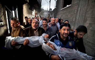
Gaza City Burial by Paul Hansen — Nov 2012 from Hackerfactor.com
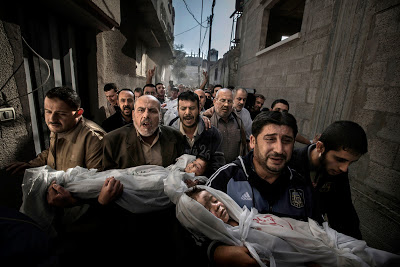
Gaza City Burial by Paul Hansen — Feb. 2013 from Hackerfactor.com