Hi there photography lovers!
It’s been a while since my last post and podcast and I hope to make up for it– shortly.
I’m lucky enough to be travelling on a photography holiday right now (I’m in Prague, CZ) and because this is a photo holiday, the photographs I am taking are precious and irreplaceable. I’d like to think that most serious photographers feel the same way and so I thought I’d share my photo backup strategy while travelling.
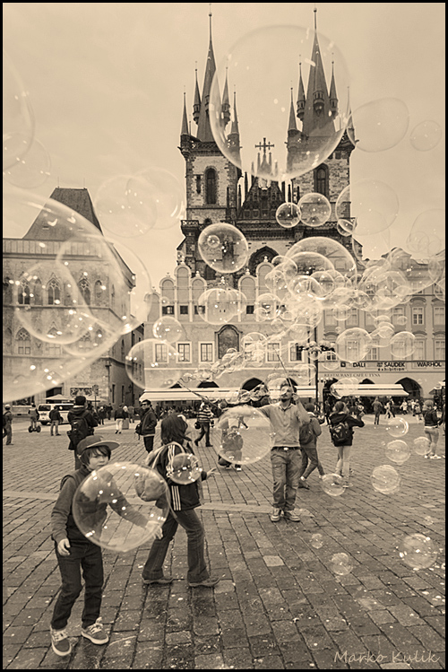
Bubbles, Kids and the Tyn Church — Prague CZ
Let me say up front that I am not uploading my RAW files to ‘the cloud’ — because uploading huge files (30 megs per file in my case) only works well when you have a super fast connection and a fast computer. Even then, it can take a looooong time to upload 50–100 files. So far I have been to London, Paris, Amsterdam and Prague. The wifi connections, on average, have been spotty everywhere I have been. (I’ve been using quality airbnb’s but so far my wifi has never ever been flawless). Therefore, uploading is out of the question and I’m basically going old school.
Here’s my simple method; The memory cards that hold the files (I brought 4 cards of 32 GB each) NEVER leave my sight. They are with me 100% of the time and easily fit into my pocket at all times when not inside my camera at my side. When my camera is not by my side, the cards are removed and go in my pocket.
In addition, I backup those files to a small portable Western Digital 2GB drive that I purchased for 79 dollars before I left. It’s around the size of a pack of 25 cigarettes. Then I usually hide that drive somewhere in the room I’m staying. This method is quite fast and efficient and it makes me feel safe. There would have to be 2 catastrophes for me to lose my data.
One last thing to note — You need a decent laptop computer to do this kind of thing. Tablets and Ipads are pure JUNK for photo editing.
If anyone has additional suggestions to share — I’d love to hear them. Thanks and many more pics to follow when I return.