 LinkBack URL
 About LinkBacks
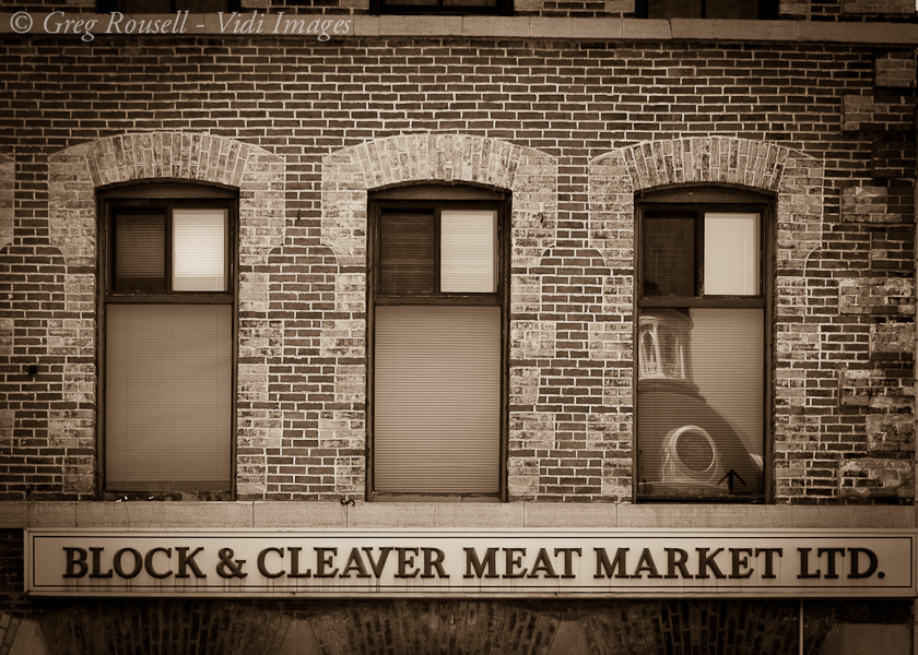
This is from a series of shots I did in downtown Kingston. It was a challenge to get the crop where I wanted it, and had to play with the vertical lens correction a bit.

This is a discussion on Block & Cleaver within the Critiques forums, part of the Photography & Fine art photography category; This is from a series of shots I did in downtown Kingston. It was a challenge to get the crop ...
 Senior Member
This is from a series of shots I did in downtown Kingston. It was a challenge to get the crop where I wanted it, and had to play with the vertical lens correction a bit.
Please feel free to check out my website: http://vidi-images.com/
Moderator
Beautiful shot!!! As for a critique, I will give it a shot. FYI, I am a novice photographer and my technical skills suck, so take my critique with a grain of salt.
The image is not level horizontally and the reflection in the right window is alittle distracting from the great lettering across the bottom. Other than that, its a great shot. I love the sepia (monochrome) you shot this in.
Senior Member
Thanks for your feedback. I levelled it across the bottom, but it remained slightly skewed at the top. I had to look up to get this shot and flattened it using Lightroom. This may be just my lack of LR skills at this point. If someone has an idea how to fix this I'd love to learn.Originally Posted by theantiquetiger

Please feel free to check out my website: http://vidi-images.com/
Senior Member
I'd go with the idea that the building is not level
I like the sepia toning and the repeating pattern. the reflection is a nice surprise too
my nit is that the right of the sign is cut off
Feel free to make comments on any of my shots
my blog: http://bambesblog.blogspot.com/
My flickr photostream: http://www.flickr.com/photos/bambe1964/
A painter takes their vision and makes it a reality. A photographer takes reality and makes it their vision.
Senior Member
Thanks Bambi. It was a tough shot to set up for. It's along a row of several stores and shops and I didn't want edge of the next building creeping into the frame. I'll play with the crop a bit and see what I can do.
Please feel free to check out my website: http://vidi-images.com/
Administrator
I quite like this. I agree w/AT about the top leveling, it's a distraction to my eye.
I really dig the sepia treatment here, but I find the contrast could be upped for more pop. I don't see enough pure white or pure black here.
- Please connect with me further
Photo tours of Montreal - Private photography courses
- Join the new Photography.ca Facebook page
- Follow me on Twitter http://twitter.com/markokulik
- Follow me on Google+ https://plus.google.com/u/0/111159185852360398018/posts
- Check out the photography podcast
"You have to milk the cow quite a lot, and get plenty of milk to get a little cheese." Henri Cartier-Bresson from The Decisive Moment.
Senior Member
I think a reflection of Godzilla/Gojira vice the rotunda would make this a nice whimsical photo.
But, I digress. Clone the left-most window contents into the right one, fiddle with it a little to make it unique. Drop the vignette and level the horizontal out, maybe boost the structure a little. Brighten (or bump the exposure a tad) and a little back to more B&W vice so much sepia. Figure out a way to bring attention to the colour runs below the lettering, perhaps (just a thought, though)
Buying a Nikon doesn't make you a photographer. It makes you a Nikon owner. ~Author Unknown
500px
My Deviantart pages
My Flickr pages
The Rogues
Senior Member
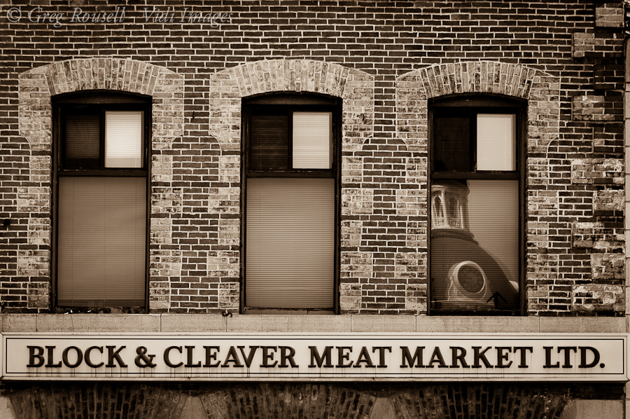
Thanks for all the input, I really appreciate it. I've tried to incorporate as much as I could - here is the revised image. I opted to leave the reflection in the window as the girlfriend likes it...and well, she wins
Please feel free to check out my website: http://vidi-images.com/
Senior Member
Nice shot. I agree with your girlfriend, the reflection should stay. (It's always wise to agree with your girlfriend)
You can fix the top in LR by using the Horizontal perspective slider under the 'Manual' section of the Lens Correction panel. By the looks of things just a +1 or +2 will do it. This will also skew the bottom slightly, so you'll have to re-rotate a little afterwards.
Senior Member
your girlfriend is right! Of course she, -she's a girl.
I like your edits very much. good job
Feel free to make comments on any of my shots
my blog: http://bambesblog.blogspot.com/
My flickr photostream: http://www.flickr.com/photos/bambe1964/
A painter takes their vision and makes it a reality. A photographer takes reality and makes it their vision.
 Posting Permissions


 Reply With Quote


Bookmarks