
 LinkBack URL
 About LinkBacks
Couldn't what forum this one belongs in so I figured here would do seeing as critique is probably what's going to help me the most.
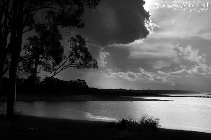
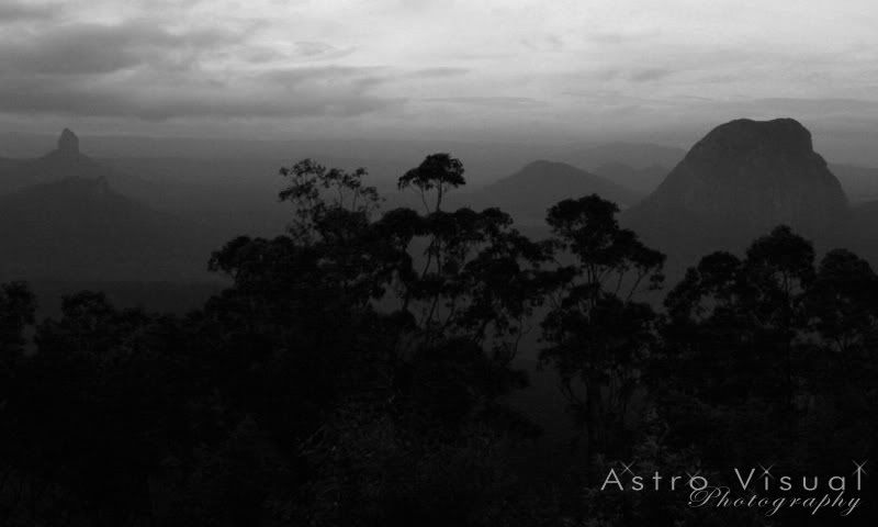
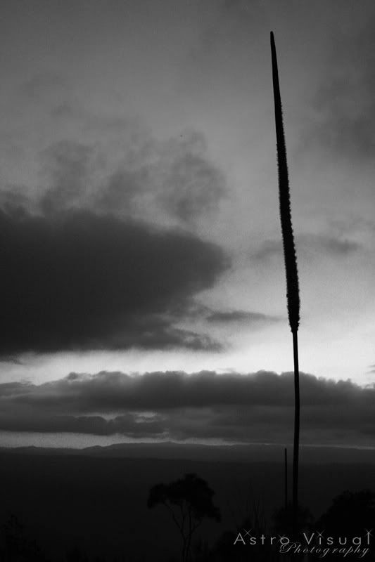
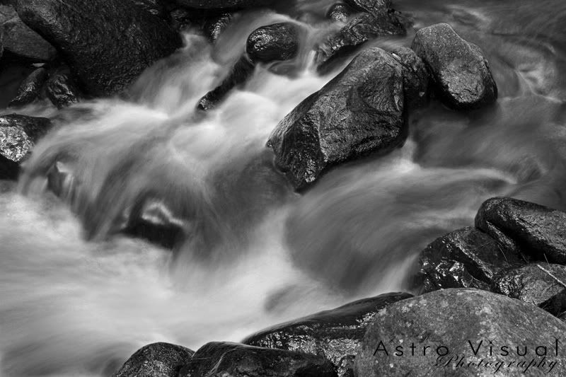
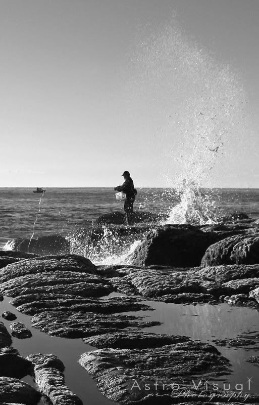
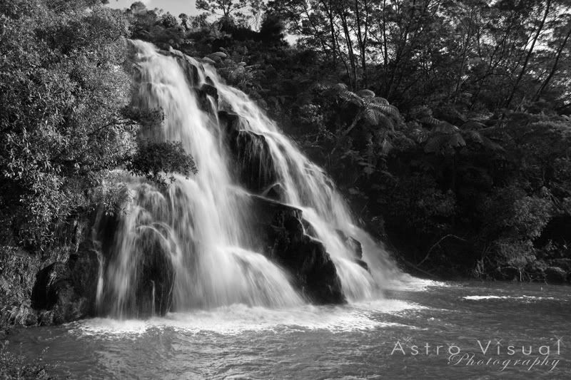
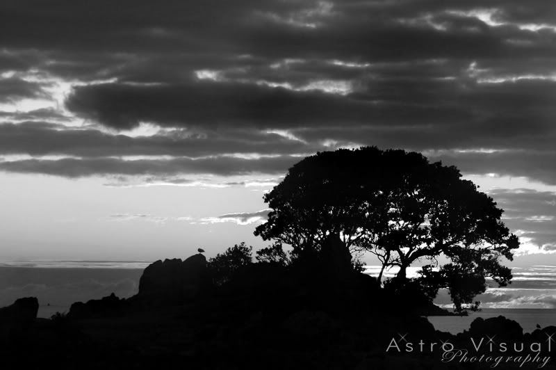
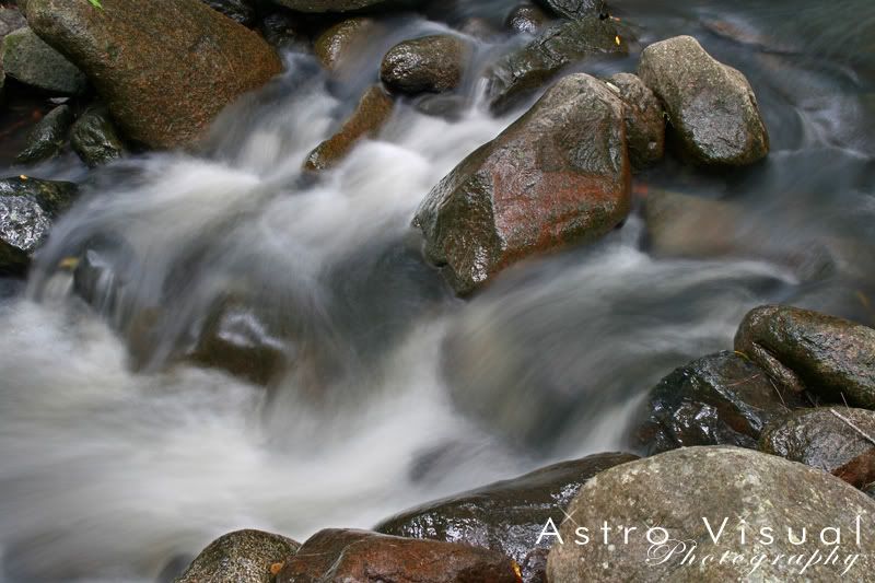
I've never really looked into B/W much before. Always been a colour boy. But now I've explored a fair bit of the colour scene I thought I'd look at some B/W.
So what I've done is search through and chosen some photos and converted them to B/W.
I'm happy for people to critique them of course, but I'd also like to know if there are any I've chosen that people think are particularly suited to B/W and also if any are not.


 Reply With Quote
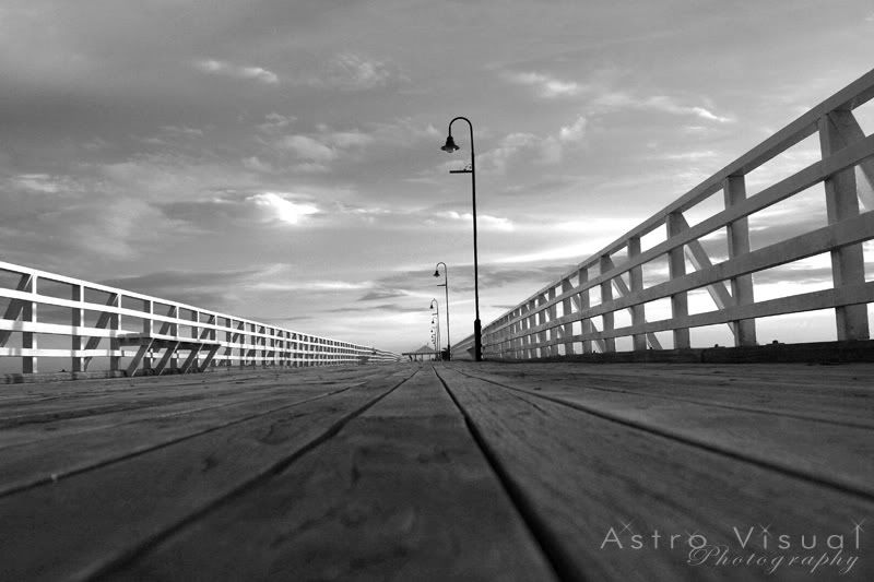


Bookmarks