
 LinkBack URL
 About LinkBacks
I know you usually only submit one or two images for critique, but I figured it was a set.
Which image and process do you like the most(or dislike), and critique it please
streetcar1 by Theantiquetiger, on Flickr
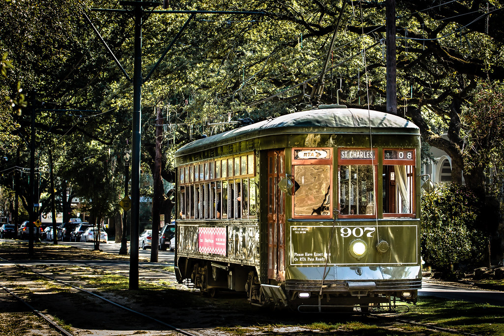
streetcar2 by Theantiquetiger, on Flickr
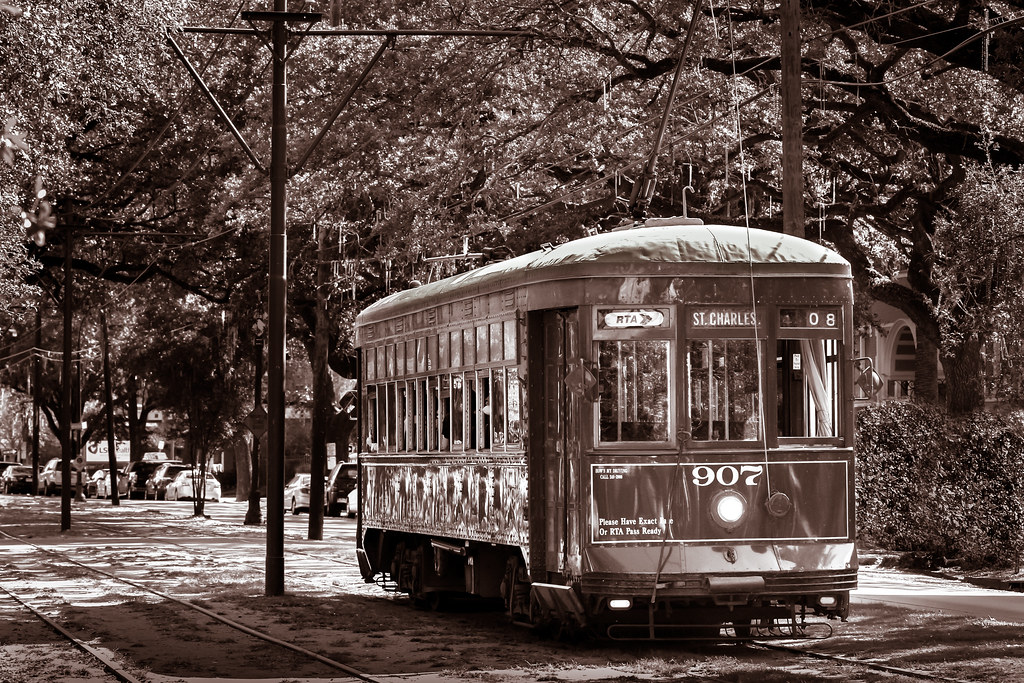
streetcar3 by Theantiquetiger, on Flickr
streetcar4 by Theantiquetiger, on Flickr
streetcar5 by Theantiquetiger, on Flickr
streetcar6 by Theantiquetiger, on Flickr


 Reply With Quote
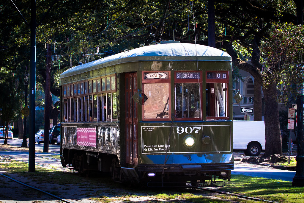
 - Please connect with me further


Bookmarks