Results 1 to 6 of 6

Critetiques please for "Colour Matching"

This is a discussion on Critetiques please for "Colour Matching" within the Critiques forums, part of the Photography & Fine art photography category; Hi, I've been working on this photo for a bit and so far this is the best I've gotten. It's ...

  1. #1
    Risacher's Avatar
    Risacher is offline Member
    Join Date
    Aug 2015
    Location
    Montreal
    Posts
    89
    My Photos
    Please ask before editing my photos
    Critiques
    Critique my photos anywhere in the forum

    Default Critetiques please for "Colour Matching"

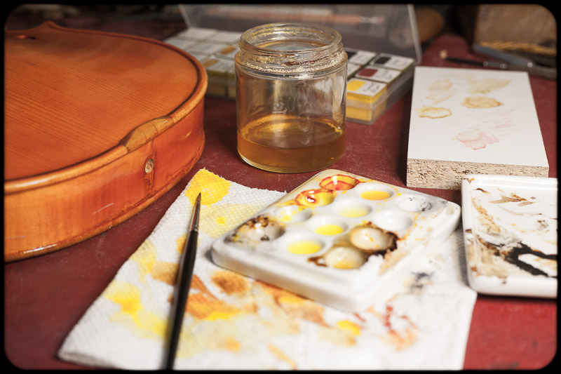
    Hi, I've been working on this photo for a bit and so far this is the best I've gotten. It's a theme that I feel should be able to make a nice photograph but each time I feel like it hasn't quite got what it takes. Any ideas to get my synapses going would be super helpful and fondly appreciated. Thanks in advance!

    "Colour Matching"

    Name:  web-4982.jpg
Views: 373
Size:  136.7 KB

  2. #2
    theantiquetiger's Avatar
    theantiquetiger is offline Moderator
    Join Date
    Aug 2011
    Location
    Baton Rouge
    Posts
    2,774
    My Photos
    Please feel free to edit my photos
    Critiques
    Critique my photos anywhere in the forum

    Default

    First off great lighting. It took me a second to figure what color matching had to do with a violin then realized you touch up painting. To me, you missed the focal point, which should be the paint pallet (or entire image) but it is out of focus. The focus is very narrow and mostly falls on the jar. I would have narrowed the f-stop to 18 (or so), so everything would be in focus. The image is a little yellow to me (may need to slightly adjust the WB). The image is nicely composed but I would maybe try moving the brush so it is completely in the frame and not a leading line going off frame.

    As for non-photography matter of the image...

    The image is a little messy. I know that's what you are going for, but I feel it is too much. The paper towel maybe hurting the image more than helping it. I would add more stains to the pallet (I'm talking different shades). Too many of the pallet cups are empty (even if you fake it with BBQ sauce and water, or other shades you can make, even if you don't really have the stain)

    Hope this helps!
    Last edited by theantiquetiger; 02-20-2016 at 01:48 AM.
    "The worst thing about taking a great image is that your next one has to be better!"

  3. #3
    JAS_Photo's Avatar
    JAS_Photo is offline Senior Member
    Join Date
    Sep 2008
    Location
    Calgary
    Posts
    7,359
    My Photos
    Please ask before editing my photos
    Critiques
    Critique my photos anywhere in the forum

    Default

    I think I would like to see a little more of the violin and possibly a hand holding the brush but that part would not be necessary. That little box of paint/stains(?) is far more interesting than the jar of oil so bring that forward more as well to see if you like it.
    Last edited by JAS_Photo; 02-20-2016 at 03:50 AM.

  4. #4
    Marko's Avatar
    Marko is offline Administrator
    Join Date
    May 2005
    Location
    Montreal, QC. Canada
    Posts
    14,870
    My Photos
    Please do NOT edit my photos
    Critiques
    Critique my photos anywhere in the forum

    Default

    Nice overall comp!

    For me though - The whites (white napkin, white block, white paint holders) are stealing the show because they are reflecting too much light...
    So if this were mine - I'd either work like crazy to reduce the light on the whites via lighting at the time of shooting, or by replacing those props at the time of shooting with darker ones...or painting on those props so they are darker. Adding non white paint stains as AT suggested is also a good idea imo.
    hope that may help
    - Please connect with me further
    Photo tours of Montreal - Private photography courses
    - Join the new Photography.ca Facebook page
    - Follow me on Twitter http://twitter.com/markokulik
    - Follow me on Google+ https://plus.google.com/u/0/111159185852360398018/posts
    - Check out the photography podcast


    "You have to milk the cow quite a lot, and get plenty of milk to get a little cheese." Henri Cartier-Bresson from The Decisive Moment.

  5. #5
    Risacher's Avatar
    Risacher is offline Member
    Join Date
    Aug 2015
    Location
    Montreal
    Posts
    89
    My Photos
    Please ask before editing my photos
    Critiques
    Critique my photos anywhere in the forum

    Default

    These are all really great suggestions, thank you so much. I have some more touch-ups to do next week, I'll give it another try with all of that in mind.

    Believe it or not, I actually dumbed down the yellow a lot in post, it just happens to be a very yellow instrument! The next one should be a more photogenic instrument.

  6. #6
    Join Date
    Sep 2014
    Location
    Toronto Canada
    Posts
    49
    My Photos
    Please ask before editing my photos
    Critiques
    Critique my photos anywhere in the forum

    Default

    Looks great. Almost like a painting.

    Thanks
    Mario
    Toronto Wedding Photographer

Bookmarks

Posting Permissions

  • You may not post new threads
  • You may not post replies
  • You may not post attachments
  • You may not edit your posts
  •  

1 2 3 4 5 6 7 8 9 10 11 12 13 14 15 16 17 18 19 20 21 22 23 24 25 26 27 28 29 30 31 32 33 34 35 36