Results 1 to 10 of 11

The tree

This is a discussion on The tree within the Critiques forums, part of the Photography & Fine art photography category; Hi, I saw this tree about a week ago, and was immediately struck by what it said. This withered old ...

Hybrid View

Previous Post Previous Post   Next Post Next Post
  1. #1
    Shinnen's Avatar
    Shinnen is offline Member
    Join Date
    Sep 2015
    Location
    Markham, Ontario
    Posts
    52
    My Photos
    Please do NOT edit my photos
    Critiques
    Critique my photos anywhere in the forum

    Default The tree

    Hi,
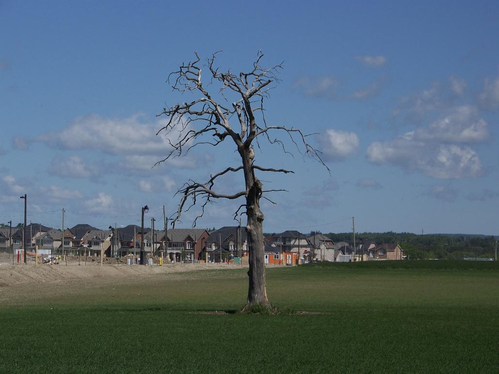
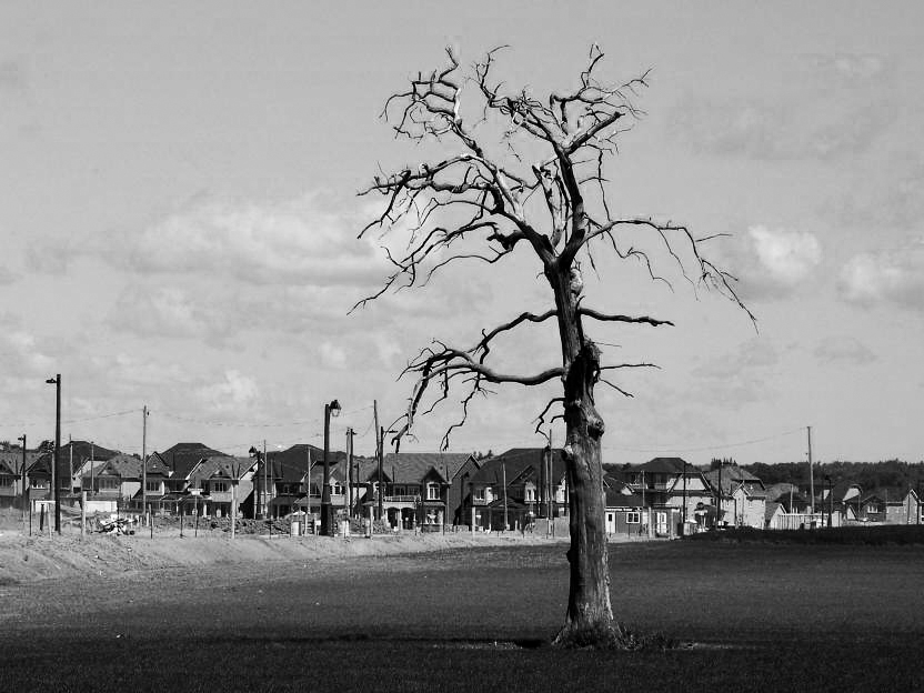
    I saw this tree about a week ago, and was immediately struck by what it said. This withered old dead hulk standing in a field next to the encroaching civilization, soon to meet the bulldozer. But, alas, the picture doesn't really say anything. Why? Wrong angle? Too far away? (Enhancing the lighting didn't really do much.) ??? I'm going to take another wack at it after I can figure out what it's missing. Any suggestions?
    ....... john

    Name:  100_0146.jpg
Views: 747
Size:  86.2 KB

  2. #2
    theantiquetiger's Avatar
    theantiquetiger is offline Moderator
    Join Date
    Aug 2011
    Location
    Baton Rouge
    Posts
    2,774
    My Photos
    Please feel free to edit my photos
    Critiques
    Critique my photos anywhere in the forum

    Default

    Since this is in the Critique section, I will give you my two cents:

    First off, the tree is a great subject, very nice find, but you are not doing it very much justice here. It is in the middle of the image. Use the basic rule of thirds, move it one side or the other.

    Second thing, always remember the human eye is naturally attracted to light. The tree is dark and is being overshadowed by the clouds, white buildings, etc. My eye wants to land on these things, no the tree. Plus the background is really distracting itself. If you have the lens, open the aperture to 2.8 (or the max that you have) to completely distort the background.

    Third, the image itself is a little flat. I would boost the contrast and saturation a little.

    Like I said, you have a great subject, it just needs presented in a better way. I would even try B&W, and/or step to your left until the building or out of the BG. It looks clear on the right side on the image.
    "The worst thing about taking a great image is that your next one has to be better!"

  3. #3
    theantiquetiger's Avatar
    theantiquetiger is offline Moderator
    Join Date
    Aug 2011
    Location
    Baton Rouge
    Posts
    2,774
    My Photos
    Please feel free to edit my photos
    Critiques
    Critique my photos anywhere in the forum

    Default

    OK, I didn't read your entire description of the photo and realize you want to include the construction. in that case, I would step to the right so the entire BG is covered in the new construction. With your permission, I would like to do a basic edit to show you my idea. i won't do it until I get your permission.
    "The worst thing about taking a great image is that your next one has to be better!"

  4. #4
    Shinnen's Avatar
    Shinnen is offline Member
    Join Date
    Sep 2015
    Location
    Markham, Ontario
    Posts
    52
    My Photos
    Please do NOT edit my photos
    Critiques
    Critique my photos anywhere in the forum

    Default

    Hi,
    Yes, of course. Please do what you like with it. I know that it's a crappy picture; but think it has great potential, that I have not been able to bring out.
    ...... john

  5. #5
    theantiquetiger's Avatar
    theantiquetiger is offline Moderator
    Join Date
    Aug 2011
    Location
    Baton Rouge
    Posts
    2,774
    My Photos
    Please feel free to edit my photos
    Critiques
    Critique my photos anywhere in the forum

    Default

    Here are a couple quick edits I did for a general idea. All I did was place the tree more to the right, and boost the saturation, contrast, and other levels.

    Name:  tree.jpg
Views: 965
Size:  74.1 KB

    Name:  treebw.jpg
Views: 787
Size:  218.1 KB
    "The worst thing about taking a great image is that your next one has to be better!"

  6. #6
    Marko's Avatar
    Marko is offline Administrator
    Join Date
    May 2005
    Location
    Montreal, QC. Canada
    Posts
    14,870
    My Photos
    Please do NOT edit my photos
    Critiques
    Critique my photos anywhere in the forum

    Default

    For me there's nothing interesting going on in the foreground and yet that foreground occupies lots of space.
    I'd reshoot it - But if I were to edit this (since you seem to be OK with editing for this pic) , here's my very quick take - (that I would still refine with dodging and burning), still respecting the original ratio - Slight levels play. nothing else done on edit one. The vertical crop on edit 2 was the same with a hint of sharpening.
    Attached Images Attached Images  


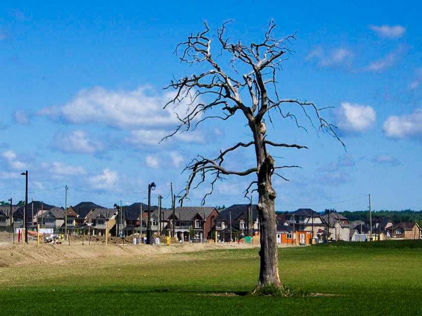
    - Please connect with me further
    Photo tours of Montreal - Private photography courses
    - Join the new Photography.ca Facebook page
    - Follow me on Twitter http://twitter.com/markokulik
    - Follow me on Google+ https://plus.google.com/u/0/111159185852360398018/posts
    - Check out the photography podcast


    "You have to milk the cow quite a lot, and get plenty of milk to get a little cheese." Henri Cartier-Bresson from The Decisive Moment.

Bookmarks

Posting Permissions

  • You may not post new threads
  • You may not post replies
  • You may not post attachments
  • You may not edit your posts
  •  

1 2 3 4 5 6 7 8 9 10 11 12 13 14 15 16 17 18 19 20 21 22 23 24 25 26 27 28 29 30 31 32 33 34 35 36