
 LinkBack URL
 About LinkBacks
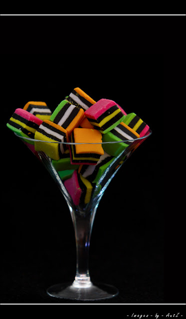
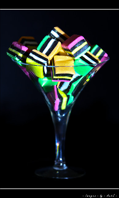
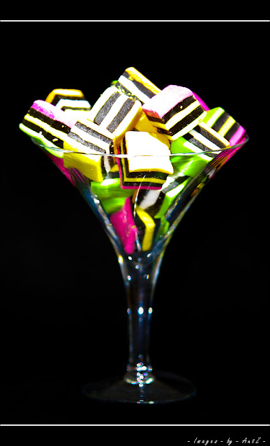
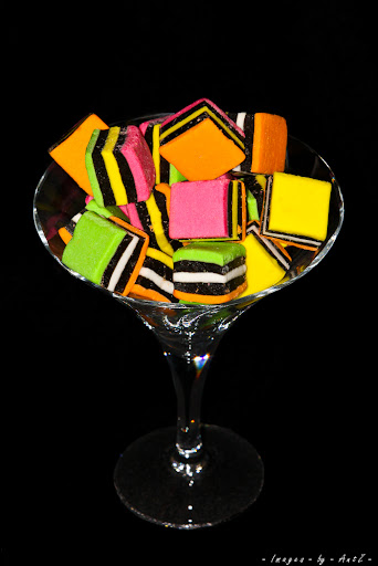
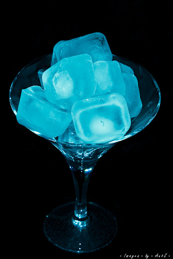
I am interested in thoughts and preferences for these images for a topic "Vibrant". Particularly the composition. Does the centred composition work, like the bottom 2? Or is this one better, which I fixed in GIMP by adding some negative space in GIMP.
This one was under lit.
I know this one is blown out, but I sort of like it, although it really defeats the purpose of this image which is for vibrant colour.
Feel free to suggest a mix of these as I have a lot of variants, or can re-setup.
Thanks in advance.


 Reply With Quote
 Partly because I had an expensive camera/lens on a tripod and one of my wifes fine glasses sitting on a stool, and a 2 year old running around.


Bookmarks