 LinkBack URL
 About LinkBacks
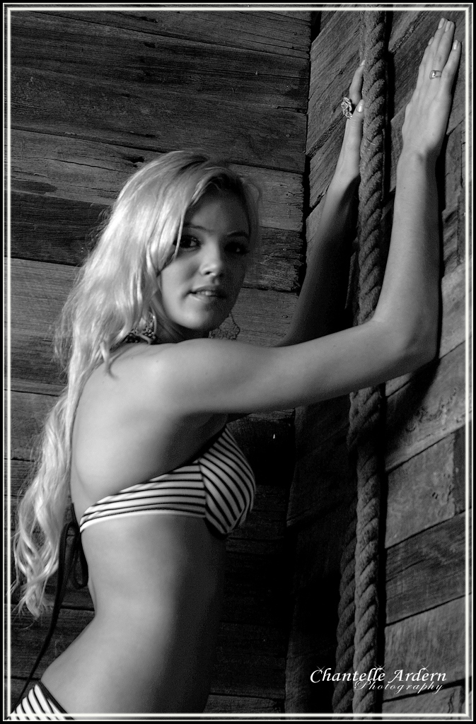
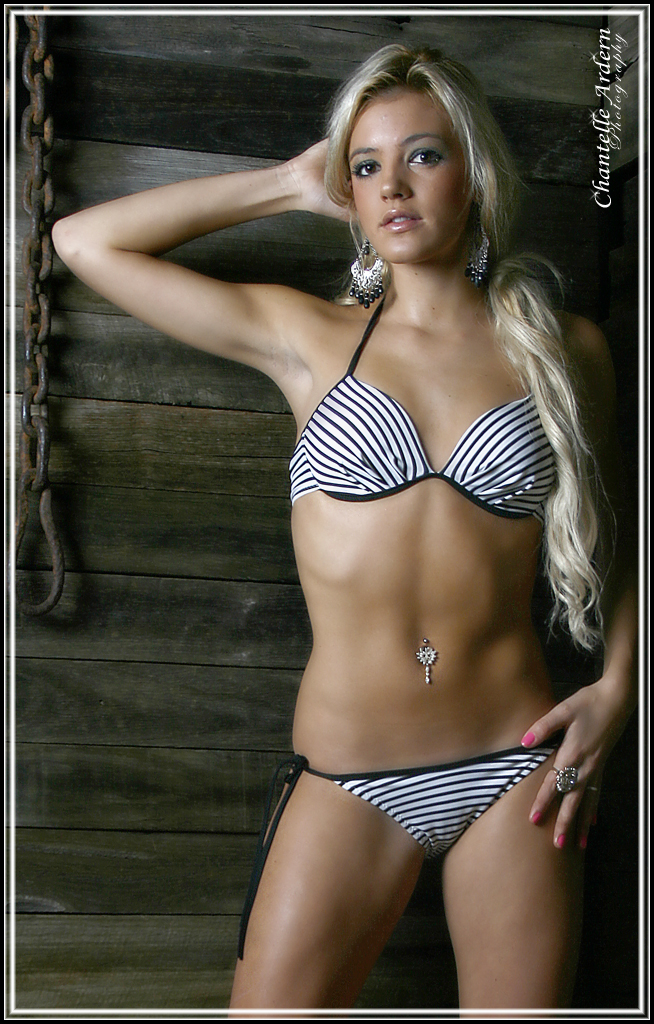
Here's a few images of a beauitful girl called Amanda in Swimwear. These shots were taken last night in my course. What do you think?
Photo1:
Photo2:
Photo3:

This is a discussion on SwimWear within the Critiques forums, part of the Photography & Fine art photography category; Here's a few images of a beauitful girl called Amanda in Swimwear. These shots were taken last night in my ...
 Senior Member
Here's a few images of a beauitful girl called Amanda in Swimwear. These shots were taken last night in my course. What do you think?
Photo1:
Photo2:
Photo3:
Moderator
I like the first one best due to the shadows and lighting. Very nice.
That second one has some chromatic aberration along her arm and I think along her left side (as we look at it) which is distracting and seeing as you are shooting at this level is something you need to look for and fix.
Administrator
I like shot 1 the best. I like how the vertical props compliment her 'vertical' pose. I may have also placed her in the corner to see if that would have worked.
Photo tours of Montreal - Private photography courses
- Join the new Photography.ca Facebook page
- Follow me on Twitter http://twitter.com/markokulik
- Follow me on Google+ https://plus.google.com/u/0/111159185852360398018/posts
- Check out the photography podcast
"You have to milk the cow quite a lot, and get plenty of milk to get a little cheese." Henri Cartier-Bresson from The Decisive Moment.
Senior Member
Shot 1 is my favorite just because the model looks at ease. Neat lighting.
My new blog as of Nov/10
http://katchickloski.wordpress.com/
Senior Member
Agree, #1 is the best. Not fond of #3 however. The conversion seems a little mid-tone rich and doesn't really suit the subject.
Senior Member
The first two shots are really good, I guess. Only the third one has a lack of sharpness and her left side of the face and left arm have too much shadow.
Senior Member
I changed the third photo to black and white to try hide the no-sharpness in it. I agree with the sharpness of that image, it's hard when I only have a small amount of time to work with and then I have to swap over with the next person. I have cropped image #2 in, this is the really crop:

 Posting Permissions


 Reply With Quote
Bookmarks