 LinkBack URL
 About LinkBacks

Hi! I am looking for some honest critiques on this shot. Its hard to get real opinions from my friends and family.
Thanks!
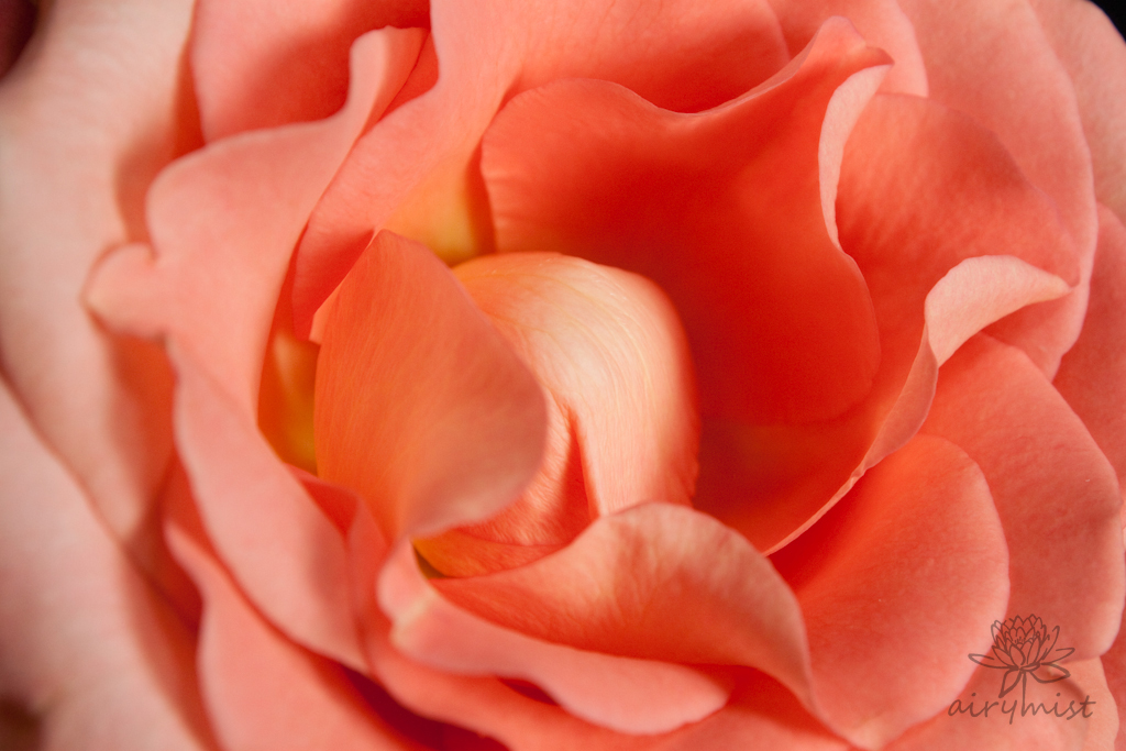

This is a discussion on A Dose of Pink in my Life within the Critiques forums, part of the Photography & Fine art photography category; Hi! I am looking for some honest critiques on this shot. Its hard to get real opinions from my friends ...
 Junior Member
Hi! I am looking for some honest critiques on this shot. Its hard to get real opinions from my friends and family.
Thanks!
Moderator
Welcome to the forum, Airymist! I'm sure you'll get what you are looking for here. I'll start with what I see...
I see a great photo! Nice work.
Fair bit of detail in the petals though I think it could use a touch more contrast.
The centre of the flower is in good focus but I'm thinking a larger DOF would have put the entire flower in focus which may have been more pleasing in this instance. I'm not a fan of having the left side out of focus for this shot. But that is really a matter of taste.
With respect to composition it's a closeup shot so it may be OK that the centre of the flower is in the centre of the photo but it is usually more pleasing seeing it on one of the thirds.
I hope this helps!
Junior Member
Thank you for your insight! ^.^
While I like this shot, I felt like it was lacking something... maybe having the flower centered is what is bothering me.
This one was also taken that day. Any feedback?

Senior Member
Welcome airymist - I wish you much fun here.
The first photo is a very good rose picture. I love the colour and mostly the composition. There are just two points for me: Maybe you could give it a tit bit more sharpness with EBV. And you should not have cropped the upper rolling petal.
Sorry, the second has nothing special to catch the eye - there you should have had more part of the rose heart.
Do you know the name of the rose? I hope you'll show more of it!
Senior Member
Hi, welcome!
I like both these shots, perhaps crop a bit of the right hand side of that second photo off, the image looks a bit too halved to me. More sharpness in both would make them better, and I agree with the contrast - especially in that first shot.
Well done over all
Moderator
Welcome to the forums Airymist.
Shot 1 ... does lack contrast as others have mentioned. I think a quick level/curves adjustment here will work wonders for that though.
Being so close up I think attaining a large DOF was going to be difficult so it was important to choose exactly what part you really wanted sharp. On the sharpness, it looks not bad but could still be sharper I think..
Shot 2 ... is a big improvement in contrast and colour. Having some of the green bokeh also helps to make that beautiful apricot colour dance more. The sharpness here looks better to me also. Composition wise though I'd have liked to see more of the flower and less of the green bokeh/background. By including the center of the flower would have made this a stronger shot in my opinion.
 Posting Permissions


 Reply With Quote
Bookmarks