 LinkBack URL
 About LinkBacks

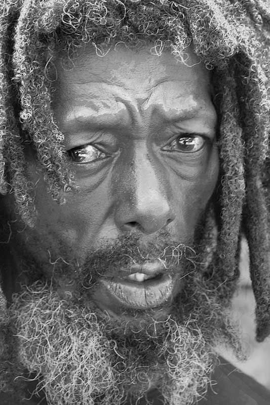
i feel naked without my filters

This is a discussion on b/w within the Digital photography forums, part of the Photography & Fine art photography category; i feel naked without my filters...
 Member
i feel naked without my filters
Last edited by automaton2; 07-17-2006 at 03:41 PM.
 Posting Permissions


 Reply With Quote
Bookmarks