 LinkBack URL
 About LinkBacks

I went in photoshop and used pen tools to make my last name. I plan on putting this on my photos as my signature. Wondering if this is all I need, or should I include the year on it, or etc.? Also feel free to comment on how you like it.


This is a discussion on Copyright picture within the Show your photo (Color) - Landscape & Nature (flowers, mountains, storms etc.) forums, part of the Photography & Fine art photography category; I went in photoshop and used pen tools to make my last name. I plan on putting this on my ...
 Senior Member
I went in photoshop and used pen tools to make my last name. I plan on putting this on my photos as my signature. Wondering if this is all I need, or should I include the year on it, or etc.? Also feel free to comment on how you like it.
Moderator
Looks cool. It depends what you are trying to achieve with this as to whether to you add things like the year or copyright symbols etc.
For instance, I put my company name on mine just part of an overall strategy in our branding. If it stops a few people from stealing the photos then cool but someone good with PS etc can often sucessfully remove a watermark fairly well, unless it's very strong but then it ruins the photo or distracts so much people won't give critique etc. Keeping the photos at 800 pixels or less (not too much if you want critique or comments) on the longest side to reduce the photos usefullness to someone else is probably the easiest way.
Senior Member
Thanks for the advice. I know that this wont prevent anyone from stealing my photos, guess I want it more as an official signature. Didn't really know if there was an unofficial way most photographers do it. I just put my name, because i don't sell my photos, and don't have a buisness like that.
Moderator
I like seeing peoples names on the photos ... especially if it lines up with their usernames etc because it helps identify them within the forums/albums etc.
The main thing is most newbies (including me when I started posting in forums) tend to make their sigs/watermarks too big and too bold. Some still think mine is a little but I'm happy with it so it stays as it is now. Try to make it appear as least distracting as possible or you will find people not commenting or appreciating the photo within forums. They can be funny like that.
Senior Member
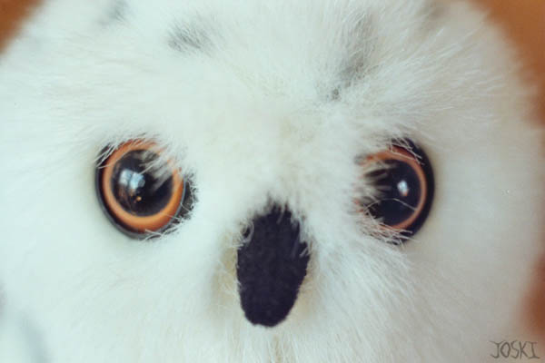
I have this saved as a psd, so I can just blend it into a pic of my choosing using opacity. I'll give an example. Is this pretty good size?
Moderator
I think that's fine myself. I can see it clearly but easilly ignore it and enjoy the photo as well. You might duplicating the layer and making one of them white will work well also on some shots.
 Posting Permissions


 Reply With Quote
Bookmarks