https://live.staticflickr.com/65535/...a79da6fd_b.jpgThe colour of summer (in spring) by Dwayne, on Flickr
Printable View
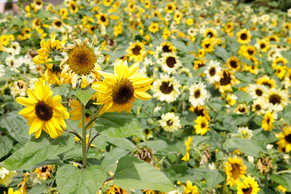
I like the comp, but the colors look wonky which is unusual for your images.
That central sunflower in the 'trinity' - looks over-processed somehow...
Thanks for the honest feedback Marko. I really do appreciate that.
This one really fell over didn't it. I also got the seasons wrong. It is Autumn not Spring :headslap:.
There wasnt a lot of processing done to this.
Re the colour. I wonder if I dropped the highlights too much?
Since last year, one thing I am doing differently is to develop in Lightroom starting with "camera standard" profile as opposed to the default "adobe color". Normally, I have found I like the colour better and cut down on the amount of processing
The middle flower does look over processed, probably do to sharpening??
Here it the original file SOOC
Attachment 22231
Ok - Big difference in seasons - and yet ya called it the Colour of Summer - lol!
the white is loss of colour...death...? that's why they are so pale?
If you didn't do much PP wise - did it look this way to your eye?