
This is a discussion on Umbrellas within the Street - Urban Photography forums, part of the Show your photo (Color) - Landscape & Nature (flowers, mountains, storms etc.) category; I deliberately pushed the processing hard on this one. Did I go too far? (it does look better on a ...
 Senior Member
Senior Member
Senior Member
Normally I don't like overly processed images but in this case I do like it.
The processing aids in bringing the wall colours out of the shadows.
Canon Rebel S II, Canon XS, Canon T5i, Canon 7D Mk2
75-300mm F4-5.6, 70-200 F4 L, 400mm F5.6 L, 500mm F4 L
My website
Flickr
Administrator
I like the comp here but to my eye it's too dark.
The umbrella people look great - but that wonderful graffiti and the girl on the stair is hidden in this dark processing imo.
- Please connect with me further
Photo tours of Montreal - Private photography courses
- Join the new Photography.ca Facebook page
- Follow me on Twitter http://twitter.com/markokulik
- Follow me on Google+ https://plus.google.com/u/0/111159185852360398018/posts
- Check out the photography podcast
"You have to milk the cow quite a lot, and get plenty of milk to get a little cheese." Henri Cartier-Bresson from The Decisive Moment.
Senior Member
I dig it ....
~~ Beauty is in the eye of the beer holder ~~
Senior Member
Certainly a great rule of thirds and leading lines photo. One of the strolling umbrella holders is looking to his left and can see the woman hidden in the doorway. All the rest of the wall art is underexposed but is intriguing in that it appears to match the colors of the umbrellas. There is so much shadow it is hard to tell what the story is. Still, the backlit tourists with umbrellas are great but my brain is asking "what are they looking at and why is that woman crouched in the doorway?" Is that the intention of your processing?
Existence has no goal. It is pure journey. The journey in life is so beautiful, who bothers for the destination. B. Rajneesh
Flickr
Senior Member
Thank all for your comments and opinions. They are much appreciated. When making these type of images it is very easy to become absorbed in the process and it is easy to see things as you want to see them rather than as they are.
This is an old shot that "hadn't made the cut" before. I was looking for a photo to play around with in Photoshop on a miserable rainy day. Whilst some people see post processing as a necessary chore, personally I love doing it and see it as an opportunity for adding artistically to an image.
I did like the basic photo, and the people with the colourful umbrellas in an urban environment were the deliberate subject of the photo. The intent was to direct attention toward the couple, but there was too much going on in terms of distracting elements (graffiti, people, lights etc). I decided to start dodging and burning to direct attention to the people with the colourful umbrellas. I still wasn't getting the isolation I wanted, so as a play I decided to go hard and and see what I could get away with.
I started by cloning out some distracting elements and painting over the bright pink paint from the top of the middle bollard. I left the 2 small arrow lights as they were pointing to the subjects. As you have identified, the most confronting part, and image altering component is the large and dark vignette. I also upped the contrast and saturation a little, and added a subtle "orton" style filter to give the "glow". The complete darkness just right of centre was real but has been exaggerated to give an unknown/sinister type of feel. To balance out the photo and to add an element of "tension" I dodged the girl on the right out of the vignette.
Last edited by Runmonty; 10-12-2016 at 02:47 AM.
Senior Member
Negative. I'm really digging this one, bro.Originally Posted by Runmonty

Senior Member
Thanks mate. I know you like contrasting dark/light plays
Senior Member
Definitely a photo that benefits from being blown up large. I don't think the forum does it any favours. I quite like it.
Senior Member
Thanks JAS. Yes the smaller version on white background here isnt ideal.
 Posting Permissions

 5Likes
 LinkBack URL
 About LinkBacks
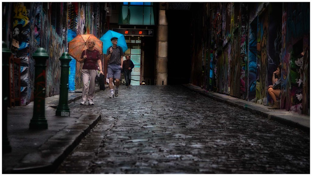


 Reply With Quote
Bookmarks