Results 1 to 8 of 8

Unfinished

This is a discussion on Unfinished within the Architecture & Man Made (cities, buildings, roads, objects & abstracts) forums, part of the Show your photo (Color) - Landscape & Nature (flowers, mountains, storms etc.) category; Mom found this at a garage sale awhile back and sent it to me. The wool is in good shape. ...

  1. #1
    QuietOne is offline Senior Member
    Join Date
    Mar 2010
    Location
    Nampa, Idaho, USA
    Posts
    2,735
    My Photos
    Please ask before editing my photos

    Default Unfinished

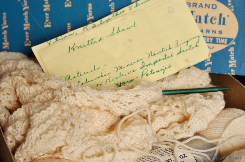
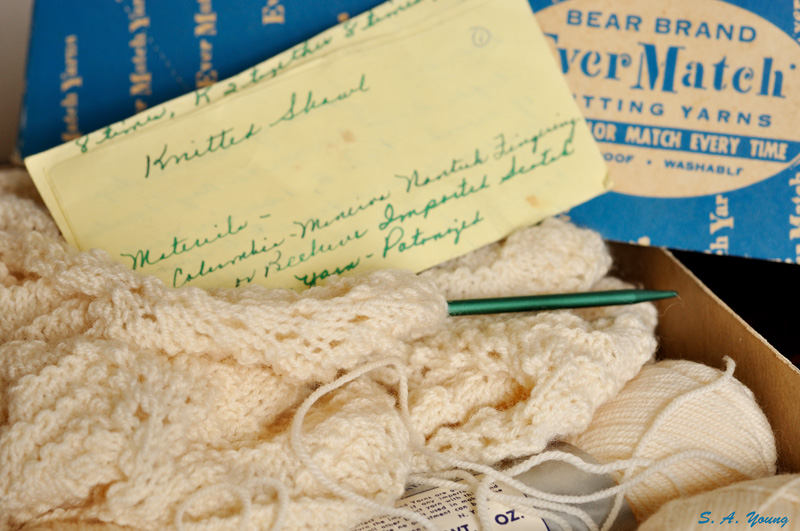
    Mom found this at a garage sale awhile back and sent it to me. The wool is in good shape. A number of stitches have fallen off one end of the circular needle. Haven't gotten to picking them up yet - I don't think it will be too hard to do. I fiddled around with it a bit this afternoon. Can't decide which view I like better.

    Name:  Knitting 1.jpg
Views: 353
Size:  189.5 KB

    Name:  Knitting 3.jpg
Views: 293
Size:  195.7 KB

  2. #2
    Realist's Avatar
    Realist is offline Senior Member
    Join Date
    Mar 2007
    Location
    Oklahoma
    Posts
    931
    My Photos
    Please ask before editing my photos
    Critiques
    Critique my photos anywhere in the forum

    Default

    I like number 2, the composition is a little more focused and less busy.

  3. #3
    Marko's Avatar
    Marko is offline Administrator
    Join Date
    May 2005
    Location
    Montreal, QC. Canada
    Posts
    14,870
    My Photos
    Please do NOT edit my photos
    Critiques
    Critique my photos anywhere in the forum

    Default

    I quite like this concept and sense of story
    - Please connect with me further
    Photo tours of Montreal - Private photography courses
    - Join the new Photography.ca Facebook page
    - Follow me on Twitter http://twitter.com/markokulik
    - Follow me on Google+ https://plus.google.com/u/0/111159185852360398018/posts
    - Check out the photography podcast


    "You have to milk the cow quite a lot, and get plenty of milk to get a little cheese." Henri Cartier-Bresson from The Decisive Moment.

  4. #4
    Runmonty's Avatar
    Runmonty is offline Senior Member
    Join Date
    Dec 2011
    Location
    Adelaide, South Australia
    Posts
    4,095
    My Photos
    Please do NOT edit my photos
    Critiques
    Critique my photos anywhere in the forum

    Default

    I like these. The tones and colours work well. I am sorry I cant help you -I cant decide which one I prefer either What a great find though, and hope you get to finish it
    I welcome all critique and comments on any of my photos

    Links to other places you can also find me :


  5. #5
    QuietOne is offline Senior Member
    Join Date
    Mar 2010
    Location
    Nampa, Idaho, USA
    Posts
    2,735
    My Photos
    Please ask before editing my photos

    Default

    Thank you. Runmonty, the color on the box is pretty typical of the late 40s or early 50s. The blue in the photo is actually still a bit cool. The blue is warmer, almost hinting at some teal tones. The brownish off-white for the yarn goes through cycles of popularity, especially for baby shawls and socks. The earliest date I found for the yarn brand and style was 1948, but that was just a quick search, and I'm guessing it was introduced a little bit earlier. It was popular well into the 60s, possibly into the early 70s. The instructions are clearly written with a fountain pen. I have the first 3 of Barbara Walker's stitch dictionaries (google it - those are the go-to reference for any knitter), so between the letter and the dictionaries I should be able to find the stitch pattern and tell where the knitter left off. Of course, finding the time to do anything with it - you should see my yarn and fabric stash!

  6. #6
    Matt K.'s Avatar
    Matt K. is offline Senior Member
    Join Date
    Feb 2010
    Location
    Calgary, AB
    Posts
    3,547
    My Photos
    Please ask before editing my photos
    Critiques
    Critique my photos anywhere in the forum

    Default

    Another vote for #2 ... makes the letter more predominant
    ~~ Beauty is in the eye of the beer holder ~~

  7. #7
    Hillbillygirl is offline Senior Member
    Join Date
    Jan 2010
    Location
    Muskoka, Ontario
    Posts
    5,612
    My Photos
    Please do NOT edit my photos
    Critiques
    Only critique photos posted in the critique forum

    Default

    Quote Originally Posted by Matt K. View Post
    Another vote for #2 ... makes the letter more predominant
    Ditto here. Plus I find the blue of the box more pleasing also. Well composed for a real story QuietOne.
    Reality is a nice place to visit, but I wouldn't want to live there!

  8. #8
    QuietOne is offline Senior Member
    Join Date
    Mar 2010
    Location
    Nampa, Idaho, USA
    Posts
    2,735
    My Photos
    Please ask before editing my photos

    Default

    Thanks, Matt and HBG.

Bookmarks

Posting Permissions

  • You may not post new threads
  • You may not post replies
  • You may not post attachments
  • You may not edit your posts
  •  

1 2 3 4 5 6 7 8 9 10 11 12 13 14 15 16 17 18 19 20 21 22 23 24 25 26 27 28 29 30 31 32 33 34 35 36