
 LinkBack URL
 About LinkBacks
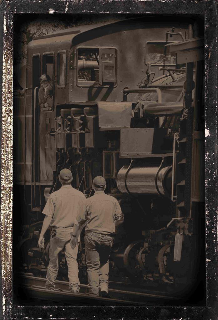
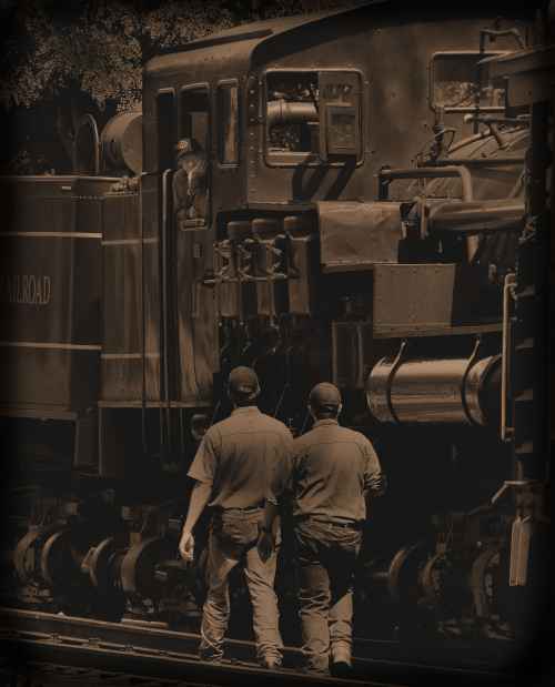
here goes... The previous version and the tinkered version....i like the lighter version, how about you?
[
QUOTE=marko;4454]I like these shots tomorrowstreasures
shot 1 - I like the sepia colour in this shot and feel it adds to the mood. I'm not convinced the shot needs the coloured hats. I think I see why you did it (modern man colour - old train monotone) but I'd love to see them without the hats to compare. I bet the shot stands on its own quite well as is shown by the other shot. Either way, the red border does seem to work with the hats. Even though many people feel it's a dated techinique, I love handpainting (actually painting on a print) and computer handpainting (selectively colouring portions in a computer image). Something seems to draw me to these images so I'm glad to see you trying it out.
Shot 2 - I'm not exactly sure what time machine refers to?
Either way - I like this version as well, I prefer it to shot 1. I like the muted tones a wee bit of brown colour. I might play with lightening the face of the guy in the train by maybe 5-10%. Aside from that I dig it. Borders too.
Hope that helps,
marko[/QUOTE]


 Reply With Quote
 I'll look forward to it.


Bookmarks