
 LinkBack URL
 About LinkBacks
I got this idea from Michaelaw's photo of "Dried Flowers..."
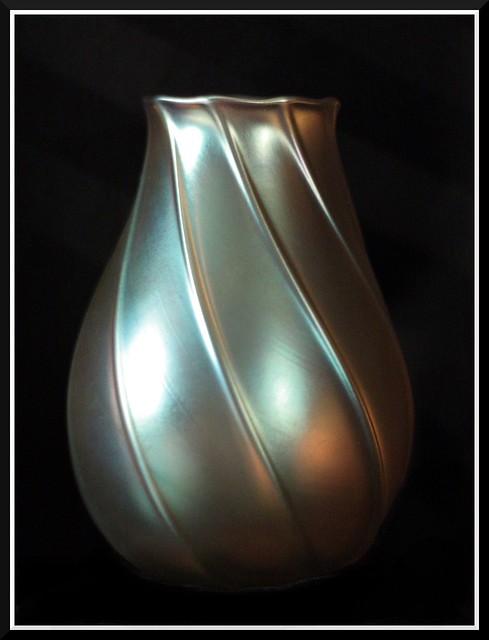
This is a signed Tiffany vase I found at a flea market about 10 years ago. It is not too valuable (about $300). It is only about 4 1/2" high and is a gold iridescent color. It was one of the first treasures I found in my treasure hunting hobby.
The only thing I've done to this image is crop and burn the black cloth under the vase due to some reflection in the fabric.
This was a second shot I did of it. All I did differently was block the reflection of background light off of it. I first thought it was out of focus (I swore I did 10x live view focus on it), than I noticed the black cloth under it is it perfect focus.
This is my third image, not as closely cropped


 Reply With Quote


Bookmarks