 LinkBack URL
 About LinkBacks
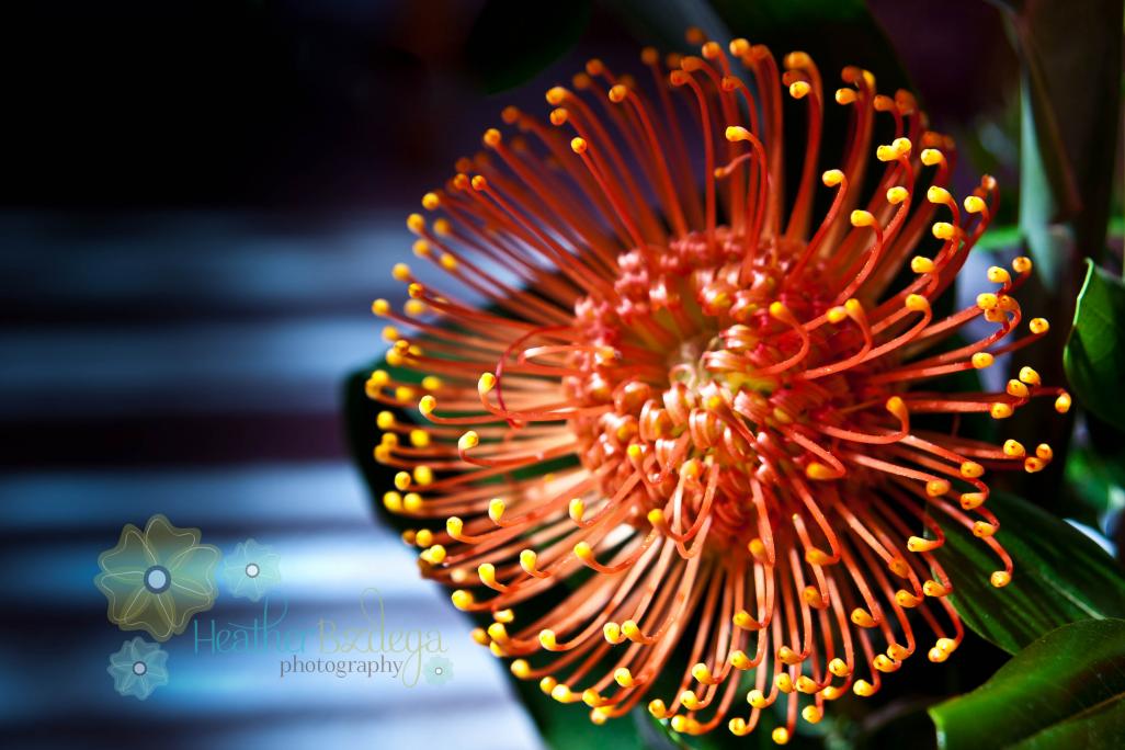
this is a recently revisited photo that I've re-edited as I have learned more techniques in lightroom. I really like the almost 80's feel of this image.

This is a discussion on techniques change and so do we.. please let me know what you think within the Critiques forums, part of the Photography & Fine art photography category; this is a recently revisited photo that I've re-edited as I have learned more techniques in lightroom. I really like ...
 Member
this is a recently revisited photo that I've re-edited as I have learned more techniques in lightroom. I really like the almost 80's feel of this image.
Moderator
I would have to see original image before really critiquing your post work, but as any flaws in PP work, I see none. As for the image, I find the flower to be a little soft (or out of focus). I am viewing this on my iPhone, so the screen is small, I could be wrong. To me, the center of the flower could be sharper, as well as the yellow tips. This issue would not be PP work, more from the original image.
Moderator
I love the colour and the composition is relatively nice. It would make a good image for an advertisement with the space on the left for ad copy. The depth of field, in my opinion, is too shallow as I would like to see the entire flower in focus and barring that at least the centre of the flower. Everyone feels differently about logos but I generally do not like them and your logo is very large and because it blends in with the background I find it hard to read which actually makes me dislike it even more than if I could read it. I think the overall softness of the image comes from the board resizing it since I see it's about 92KB which was done because it is 1026 pixels wide. If you keep it under 1025 and less than 275KB the board won't resize it.
It's a very pretty subject and I love seeing the colour at this time of year as my world feels mostly grey and blah. Thanks for sharing some of your colours
Administrator
Dig the colours here bigtime. But I agree w/the others. My eye wants to see more sharpness (OR much more blurriness) in the flower.
Photo tours of Montreal - Private photography courses
- Join the new Photography.ca Facebook page
- Follow me on Twitter http://twitter.com/markokulik
- Follow me on Google+ https://plus.google.com/u/0/111159185852360398018/posts
- Check out the photography podcast
"You have to milk the cow quite a lot, and get plenty of milk to get a little cheese." Henri Cartier-Bresson from The Decisive Moment.
 Posting Permissions


 Reply With Quote
Bookmarks