Results 1 to 4 of 4

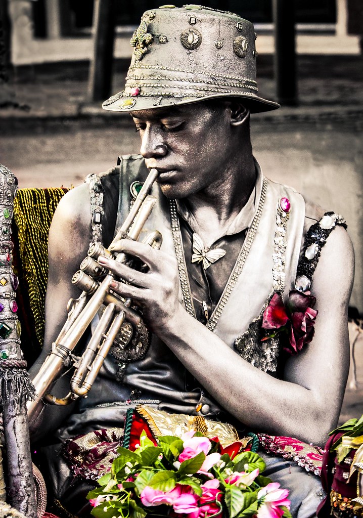
New Orleans Street Performer - Re-edit version

This is a discussion on New Orleans Street Performer - Re-edit version within the Critiques forums, part of the Photography & Fine art photography category; I posted this one in People section. I went back and edited this one and kind of like the way ...

  1. #1
    theantiquetiger's Avatar
    theantiquetiger is offline Moderator
    Join Date
    Aug 2011
    Location
    Baton Rouge
    Posts
    2,774
    My Photos
    Please feel free to edit my photos
    Critiques
    Critique my photos anywhere in the forum

    Default New Orleans Street Performer - Re-edit version

    I posted this one in People section. I went back and edited this one and kind of like the way it came out. Without going back to look at the original, what flaws do you see (mostly in the background)?

    I desaturated the BG some to get it to blend with some things I cloned out. He is not desaturated, he is that color.


    robot bw by Theantiquetiger, on Flickr
    Last edited by theantiquetiger; 08-11-2013 at 06:35 PM.
    "The worst thing about taking a great image is that your next one has to be better!"

  2. #2
    Marko's Avatar
    Marko is offline Administrator
    Join Date
    May 2005
    Location
    Montreal, QC. Canada
    Posts
    14,870
    My Photos
    Please do NOT edit my photos
    Critiques
    Critique my photos anywhere in the forum

    Default

    I like it- The background blends well for me.
    I'd probably desaturate the flowers as well.
    - Please connect with me further
    Photo tours of Montreal - Private photography courses
    - Join the new Photography.ca Facebook page
    - Follow me on Twitter http://twitter.com/markokulik
    - Follow me on Google+ https://plus.google.com/u/0/111159185852360398018/posts
    - Check out the photography podcast


    "You have to milk the cow quite a lot, and get plenty of milk to get a little cheese." Henri Cartier-Bresson from The Decisive Moment.

  3. #3
    Jim Scrimger is offline Senior Member
    Join Date
    Jun 2013
    Location
    Prescott, Ontario
    Posts
    529
    My Photos
    Please ask before editing my photos
    Critiques
    Critique my photos anywhere in the forum

    Default

    An eye catching street portrait. Agree with Marko re less color in flowers - they take attention away from his face.

  4. #4
    Runmonty's Avatar
    Runmonty is offline Senior Member
    Join Date
    Dec 2011
    Location
    Adelaide, South Australia
    Posts
    4,095
    My Photos
    Please do NOT edit my photos
    Critiques
    Critique my photos anywhere in the forum

    Default

    Yep - this one is the winner for me. Nice work on the background. I would consider de-saturatingsome of the colour a little (but not totally). The colour on his vest and hat look OK but the flowers and the yellow chair could come done imo
    I welcome all critique and comments on any of my photos

    Links to other places you can also find me :


Bookmarks

Posting Permissions

  • You may not post new threads
  • You may not post replies
  • You may not post attachments
  • You may not edit your posts
  •  

1 2 3 4 5 6 7 8 9 10 11 12 13 14 15 16 17 18 19 20 21 22 23 24 25 26 27 28 29 30 31 32 33 34 35 36