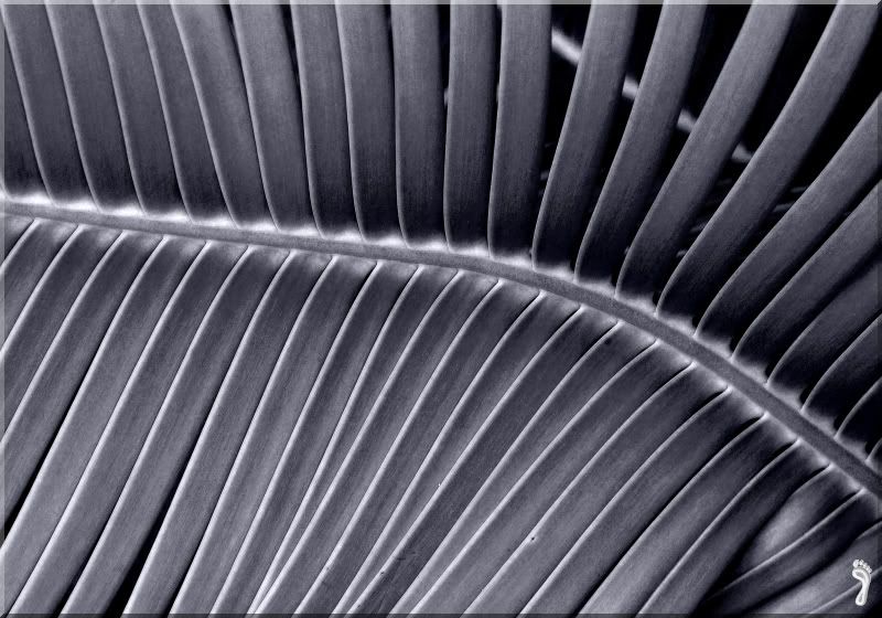
Sorta at a loss as to what to call this one. Heck, I cant even tell if its a keeper or not.
Any suggestions?

This is a discussion on Untitled within the Critiques forums, part of the Photography & Fine art photography category; ...
Sorta at a loss as to what to call this one. Heck, I cant even tell if its a keeper or not.
Any suggestions?

I like this; I think the image works well 'though I'm not sure a slight boost in contrast would go amiss. You might also consider cloning out the horizontal bit behind the main subject in the upper-right.
I really like this! Love the pattern!!!
My new blog as of Nov/10
http://katchickloski.wordpress.com/
I agree Tirediron with all he critiqued, and the second image is definitely better than the first. Nicely fixed up, I like it.
I 'preciate that, Chantelle
Yup T'I's critique and your fix is bang on!
- Please connect with me further
Photo tours of Montreal - Private photography courses
- Join the new Photography.ca Facebook page
- Follow me on Twitter http://twitter.com/markokulik
- Follow me on Google+ https://plus.google.com/u/0/111159185852360398018/posts
- Check out the photography podcast
"You have to milk the cow quite a lot, and get plenty of milk to get a little cheese." Henri Cartier-Bresson from The Decisive Moment.
Ncie work. I liek the edit. The black and white works well.
www.steelcityphotography.com
My mistake has been seeking new landscapes. I should have been seeking new light.
The first thing I thought of was the Pharaohs Air Conditioner.
I like the composition, the spine makes me follow it's path through the photo nicely.
The B&W doesn't work for me though. But then I'm often not impressed with B&W's. I think a subdued colour treatment might have worked better. Just my opinion.
Pattern and sharpness are great - and the second picture is better.
But I miss the colour - I don't prefer here b & w.

Bookmarks