Page 1 of 2 12 LastLast
Results 1 to 10 of 16

In the Studio

This is a discussion on In the Studio within the Critiques forums, part of the Photography & Fine art photography category; Michael has a show coming up in a few weeks. He has a loft studio in an old warehouse that ...

  1. #1
    JAS_Photo's Avatar
    JAS_Photo is offline Senior Member
    Join Date
    Sep 2008
    Location
    Calgary
    Posts
    7,359
    My Photos
    Please ask before editing my photos
    Critiques
    Critique my photos anywhere in the forum

    Default In the Studio

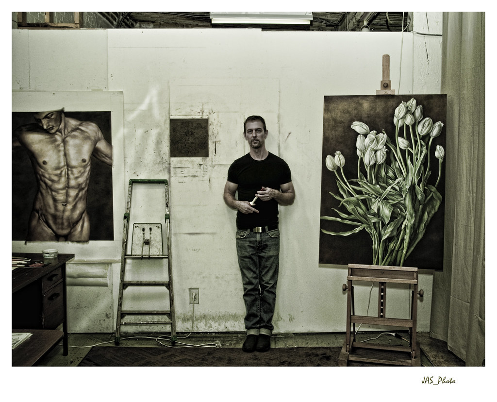
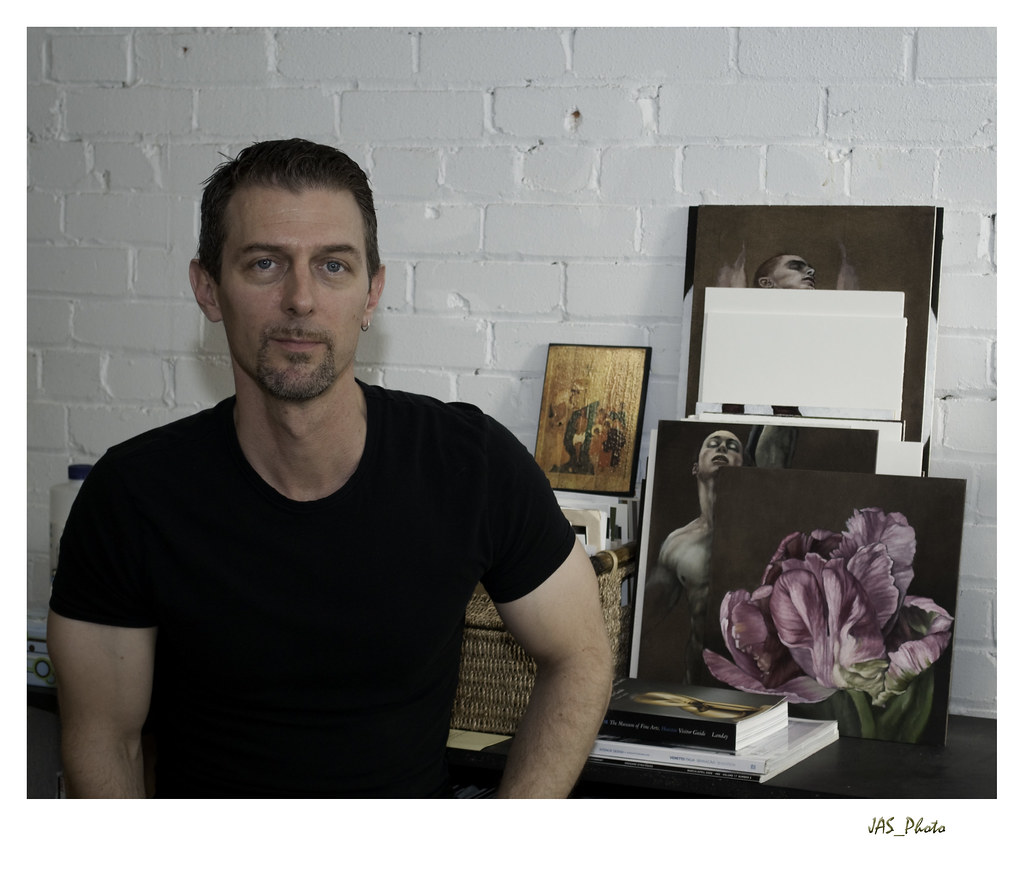
    Michael has a show coming up in a few weeks. He has a loft studio in an old warehouse that he works in. I wanted to try an environmental portrait of him and a desaturated, grunge look is what I was looking for. I will most likely work on this some more but here is the general idea. I also took a few more 'conventional' type photos but this is the one I want to work out first.


  2. #2
    tomorrowstreasures is offline Senior Member
    Join Date
    Aug 2008
    Location
    Midwest - USA
    Posts
    1,940
    My Photos
    Please ask before editing my photos

    Default

    Hey raiven - for that desat grunge look-----if you have lightroom 2 scott kelby suggests in his book 'the adobe photoshop lightroom 2 book for digital photographers' to go to develop mode, basic panel...drag recovery, fill light, contrast, clarity and vibrance all the way to the right --- 'you want a super sharp image with really vivid colors, but overall a desaturated feel' so next, you drag the saturation almost all of the way to the left -until saturation has a hint of color left. --- this brings out lots of detail. then - add an edge vignette.

    the bit at the top - the see through to the next space over is really distracting to me - i would crop that out.

    other than that - i think you have a winner here!!!

  3. #3
    jlabel is offline Senior Member
    Join Date
    Feb 2009
    Location
    Brazil - Sao Paulo
    Posts
    298

    Default

    Great picture. You may want to photograph him at work instead of just posing

  4. #4
    tirediron is offline Senior Member
    Join Date
    Jul 2008
    Posts
    1,201

    Default

    Hmmm... liking the treatment, not quite so sure about the composition. "Environmental portrait" notwithstanding, it's rather too symetrical for my taste, that is, the subject roughly centred between two paintings. I think I would prefer to see the LH side cropped to about the ladder which would focus more attention on the subject. I agree with having him working, or at least doing something. As is, it's not bad, but I think it would be stronger if he wasn't looking directly into the camera.

  5. #5
    Marko's Avatar
    Marko is offline Administrator
    Join Date
    May 2005
    Location
    Montreal, QC. Canada
    Posts
    14,870
    My Photos
    Please do NOT edit my photos
    Critiques
    Critique my photos anywhere in the forum

    Default

    Nice work!
    I very much like this shot and think it's a good environmental portrait. I agree with T.I. on the placement of the subject, just a wee bit too centered. I like the tones and treatment here except on the subject who looks a tad too green to me.

    Everything else I really like including the view into the next 'space' from the top. I would not crop it. hope that helps- Marko
    - Please connect with me further
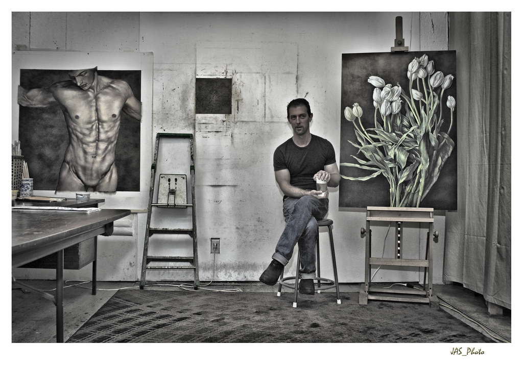
    Photo tours of Montreal - Private photography courses
    - Join the new Photography.ca Facebook page
    - Follow me on Twitter http://twitter.com/markokulik
    - Follow me on Google+ https://plus.google.com/u/0/111159185852360398018/posts
    - Check out the photography podcast


    "You have to milk the cow quite a lot, and get plenty of milk to get a little cheese." Henri Cartier-Bresson from The Decisive Moment.

  6. #6
    JAS_Photo's Avatar
    JAS_Photo is offline Senior Member
    Join Date
    Sep 2008
    Location
    Calgary
    Posts
    7,359
    My Photos
    Please ask before editing my photos
    Critiques
    Critique my photos anywhere in the forum

    Default

    A variation of the first.


  7. #7
    AcadieLibre's Avatar
    AcadieLibre is offline Senior Member
    Join Date
    Mar 2008
    Location
    Toronto, Ontario, Canada.
    Posts
    2,151
    My Photos
    Please do NOT edit my photos
    Critiques
    Only critique photos posted in the critique forum

    Default

    I really like what you did with the top photo, the second one is nice but the pose in the first one makes it work very well.
    “I take photographs with love, so I try to make them art objects. But I make them for myself first and foremost - that is important.” Jacques-Henri Lartigue

    "All that is necessary for the triumph of evil is that good men do nothing." Edmund Burke

    "Vive L'Acadie, Liberté, égalité, fraternité, ou la mort!"


  8. #8
    JAS_Photo's Avatar
    JAS_Photo is offline Senior Member
    Join Date
    Sep 2008
    Location
    Calgary
    Posts
    7,359
    My Photos
    Please ask before editing my photos
    Critiques
    Critique my photos anywhere in the forum

    Default

    THanks for the comments, everyone. Very helpful.

  9. #9
    kat
    kat is offline Senior Member
    Join Date
    Jan 2009
    Location
    Vancouver
    Posts
    4,329
    My Photos
    Please ask before editing my photos
    Critiques
    Only critique photos posted in the critique forum

    Default

    Really nice treatment. The first pose is defintaly better but loving that starbucks...oh how I miss the city life!
    My new blog as of Nov/10
    http://katchickloski.wordpress.com/

  10. #10
    JAS_Photo's Avatar
    JAS_Photo is offline Senior Member
    Join Date
    Sep 2008
    Location
    Calgary
    Posts
    7,359
    My Photos
    Please ask before editing my photos
    Critiques
    Critique my photos anywhere in the forum

    Default

    Lol, Kat I took his coffee away from him and made him hold a paintbrush in the first photo.

    The small piece on the wall is a work in progress, the one on the easel is a finished piece. He actually works with photos hung on the wall rather than on an easel.

    Here is the 'Mom Ready' photo we took:


Page 1 of 2 12 LastLast

Bookmarks

Posting Permissions

  • You may not post new threads
  • You may not post replies
  • You may not post attachments
  • You may not edit your posts
  •  

1 2 3 4 5 6 7 8 9 10 11 12 13 14 15 16 17 18 19 20 21 22 23 24 25 26 27 28 29 30 31 32 33 34 35 36