
 LinkBack URL
 About LinkBacks
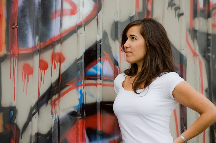
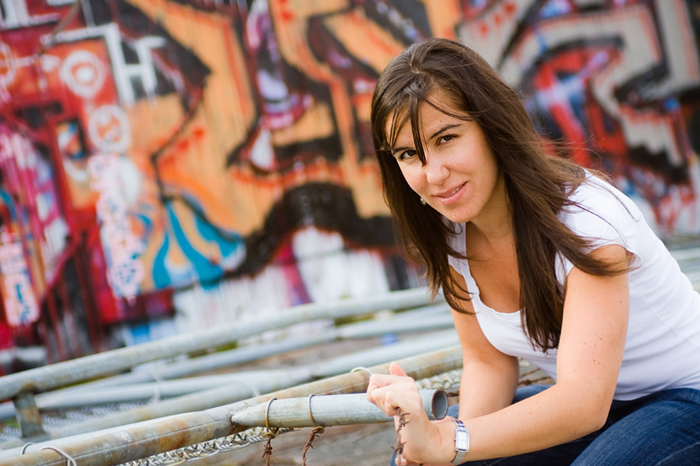
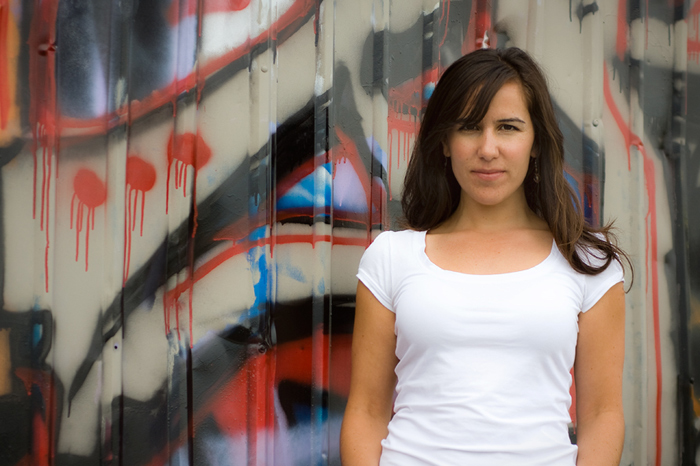
Constructive comments welcome epically looking for help with style and setup of great portrait photography. Finally got around to these, they were taken at the end of Oak St. in Vancouver back in Sept.
These were all taken with natural light, ~110mm @ F2.8.


 Reply With Quote


Bookmarks