
 LinkBack URL
 About LinkBacks
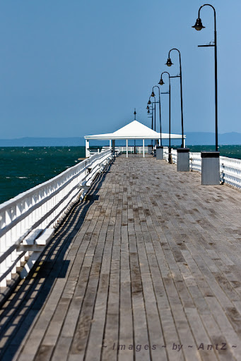
I originally posted the colour version as my submission for the monthly assignment. But afterwards, I applied a B&W preset and despite losing some detail in the far background, I liked the result. Which do you preferr? Any other thoughts on this image? It was taken early afternoon, with quite harsh light. Not ideal, but I have to shoot when I can get time.


 Reply With Quote
 :
:

 Both are very nice, though.


Bookmarks