 4Likes
 LinkBack URL
 About LinkBacks
Thank you for viewing.

This is a discussion on Some street shots from the last few months within the Street - Urban Photography forums, part of the Show your photo (Color) - Landscape & Nature (flowers, mountains, storms etc.) category; Thank you for viewing....
 Senior Member
Thank you for viewing.
Senior Member
Administrator
I find lovely little details in every image - wonderful set. Some standouts for me are;
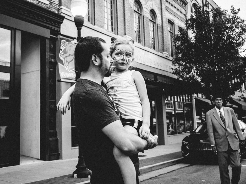
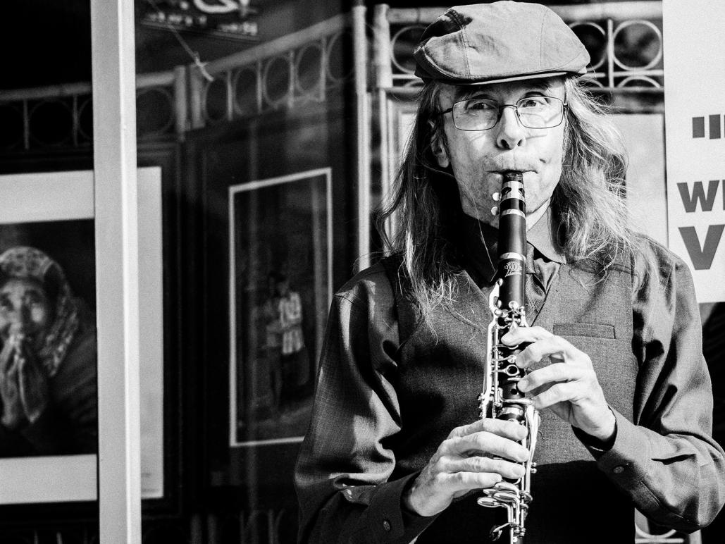
Post 1 Shot 1 It's your overall winner - that's clear to my eye at least.
The dreamy stare of the child against the darker reality of the man at right - love it.
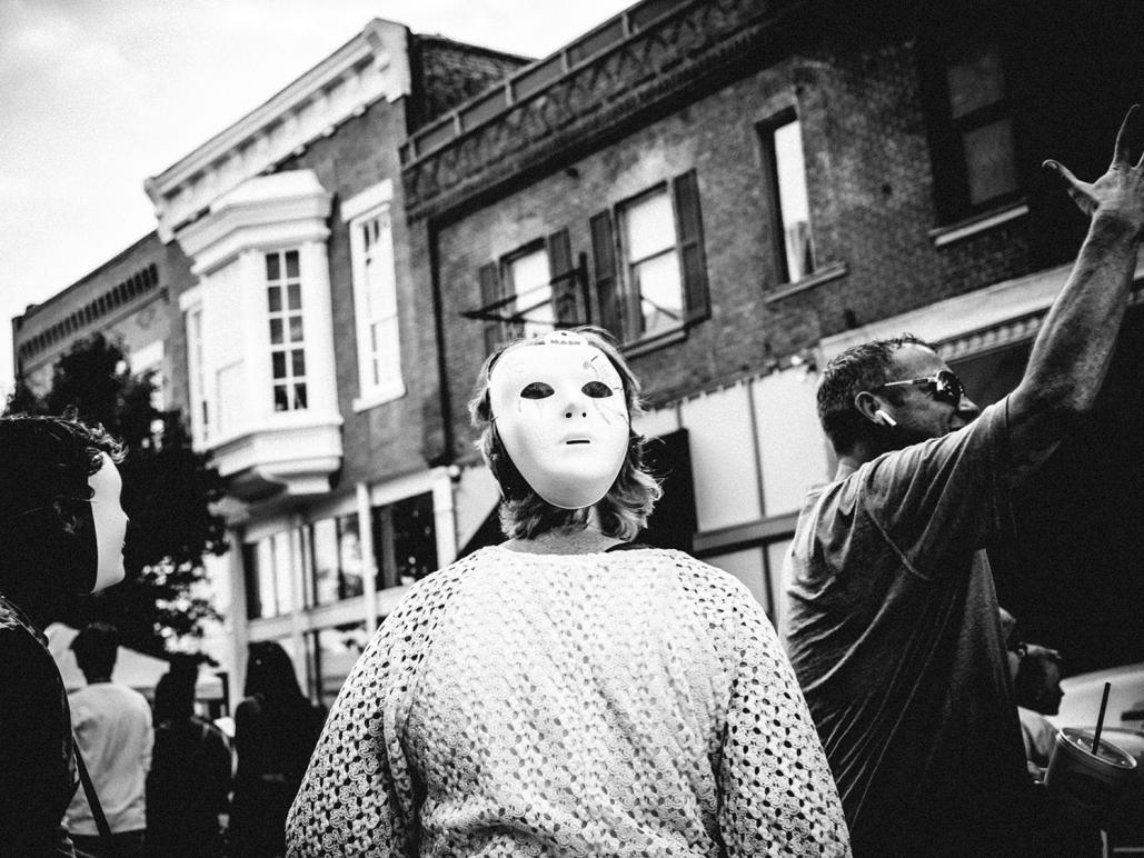
Post 1 shot 2 also taken at that decisive moment - I dig the gestures/masks combination.
Post 2 shot 1 - compliments Post 1 Shot 1 - The combination of eyes in the balloon, the tension on the clutched bear and the curious child's eyes works big time.
well done sir!
- Please connect with me further
Photo tours of Montreal - Private photography courses
- Join the new Photography.ca Facebook page
- Follow me on Twitter http://twitter.com/markokulik
- Follow me on Google+ https://plus.google.com/u/0/111159185852360398018/posts
- Check out the photography podcast
"You have to milk the cow quite a lot, and get plenty of milk to get a little cheese." Henri Cartier-Bresson from The Decisive Moment.
Senior Member
Thank you Marko. i really appreciate your comments!
Senior Member
This is some impressive street photography imho.
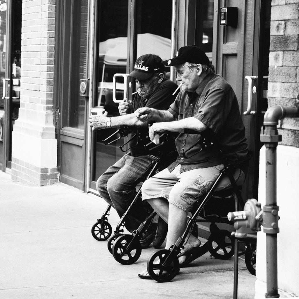
All of the B & W shots appeal to me, but especially Set 1 photo 1 and the Second post for the reasons Marko mentioned. Some of the subtle inclusions such as the guy on the right in shot 1 and the photos in the background in shot 4 are very effective to me.
Administrator
my pleasure - it's a fine post!Originally Posted by Lorey

I do have a small niggle on shot 4 post 1 - let me know if you'd like me to name it....given that you have "Only critique photos posted in the critique forum" checked.
Cheers!
Photo tours of Montreal - Private photography courses
- Join the new Photography.ca Facebook page
- Follow me on Twitter http://twitter.com/markokulik
- Follow me on Google+ https://plus.google.com/u/0/111159185852360398018/posts
- Check out the photography podcast
"You have to milk the cow quite a lot, and get plenty of milk to get a little cheese." Henri Cartier-Bresson from The Decisive Moment.
Senior Member
RM, I appreciate your time to look and your kind comments.
Senior Member
Sure Marko. I have no problem with some constructive criticism. I’d like to hear it.
Moderator
This is a wonderful set of images, Lorey. I can't pick a favourite, I love them all!
Administrator
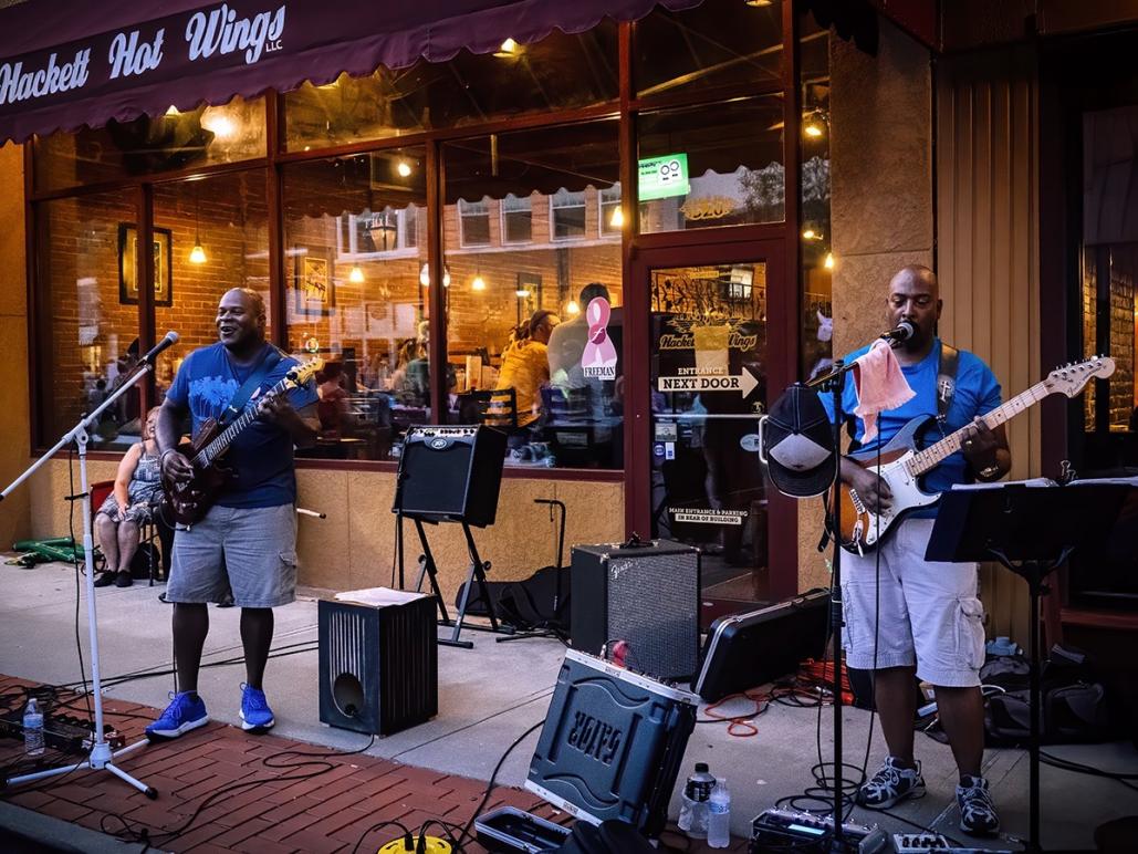
Sure - In post 1 shot 4 (fab shot BTW) the magic for me is in the eyes of the musician versus the eyes of the framed woman in the headscarf.
I know you are a deliberate framer...maybe there was a distraction...But you cut through her face a bit. I think I'd like to see 2 more inches on that left side...maybe until the white matting if that was possible... to reveal a bit more of the woman, so the juxtaposition becomes more apparent. (maybe you even have a wider version).
If for whatever reason you hate that idea or don't have it wider - perhaps a 10-20% dodge in the head scarfed face might also help. Or maybe you just wanted it this way, it does add a bit of tension.
Just a few thoughts - wonderful image no matter what.
Photo tours of Montreal - Private photography courses
- Join the new Photography.ca Facebook page
- Follow me on Twitter http://twitter.com/markokulik
- Follow me on Google+ https://plus.google.com/u/0/111159185852360398018/posts
- Check out the photography podcast
"You have to milk the cow quite a lot, and get plenty of milk to get a little cheese." Henri Cartier-Bresson from The Decisive Moment.
 Posting Permissions


 Reply With Quote
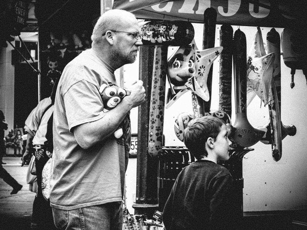
Bookmarks