Photography podcast #115 features an interview with Colour expert Joe Brady who works for Macgroup US.
Joe knows pretty much everything there is to know about getting accurate colour from your monitor and your printer. Joe has recorded 2 podcasts with us already about monitor calibration and those links are listed below in the shownotes. In this podcast, we tackle some colour concepts that are a source of confusion for many people. We talk about monitor settings like colour temperature, gamma, and luminance. Then we tackle the sRGB, Adobe RGB and Prophoto RGB colour spaces and explain what they are, the advantages of each and when and where they are most useful. Finally, Joe recommends some calibration tools, monitors and printers.
Scroll to the BOTTOM of this post to find the player to immediately listen to the audio podcast.
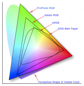
This image shows off the 3 main color spaces. You’ll note that the ProPhoto RGB color space contains the most colors. This makes it the best color space for printing your own images on a quality printer. When posting to the web, the colour space should be sRGB as that is the type of monitor that most people have.
Links /resources mentioned in this podcast:
Podcast 62 – Monitor – printer calibration – Interview with Joe Brady
Podcast 63 – Review of the Colormunki and the i1XTreme
Joe Brady Photography
X-Rite ColorMunki Photo Color Management Solution at B&H
X-Rite ColorMunki Display at B&H
Eizo FlexScan SX2262W at B&H
Eizo ColorEdge CG223W 22 at B&H
If you liked this podcast and want to review it on Itunes, this link gets you to the main page
If you are interested in writing for our blog please contact me photography.ca ( A T ) G m ail Dot co m (using standard email formatting)
Please join the Photography.ca fan page on Facebook
My Facebook profile — Feel free to “friend” me — please just mention Photography.ca
My Twitter page — I will follow you if you follow me — Let’s connect — PLEASE email me and tell me who you are in case I don’t reciprocate because I think you are a spammer.
If you are still lurking on our forum,
feel free to join our friendly ![]() Photography forum
Photography forum
Thanks to Mikey88 who posted a blog comment about our last podcast. Thanks as well to everyone that sent comments by email about our last podcast. Although ALL comments are appreciated, commenting directly in this blog is preferred. Thanks as well to all the new members of the bulletin board. Most of the links to actual the products are affiliate links that help support this site. Thanks in advance if you purchase through those links.
If you are looking at this material on any other site except Photography.ca — Please hop on over to the Photography.ca blog and podcast and get this and other photography info directly from the source. |Subscribe with iTunes|Subscribe via RSS feed |Subscribe with Google Reader|Subscribe for free to the Photography podcast — Photography.ca and get all the posts/podcasts by Email
You can download this photography podcast directly by clicking the preceding link or listen to it almost immediately with the embedded player below.
Thanks for listening and keep on shooting!
Podcast: Play in new window | Download


Interesting episode. Next time you talk to Joe I’ve got kind of a nerdy question I’d love to hear him answer. Monitors have a gamma — almost always 2.2. But color spaces also have a gamma. sRBG is also 2.2, I believe. ProPhoto is 1.8. How does the color space’s gamma affect the appearance of an image? Why would a color space be designed with a different gamma than the 2.2 value that has become the defacto standard? Does it just pre-date the move to 2.2?
Simple explanations for topics that confuse us all.
Great podcast and keep them coming. Thanks!!