
 2Likes
 LinkBack URL
 About LinkBacks
Just a couple of quick comments AT. Will try to have a longer look later when I get more time. You wanted harsh to so here goes..
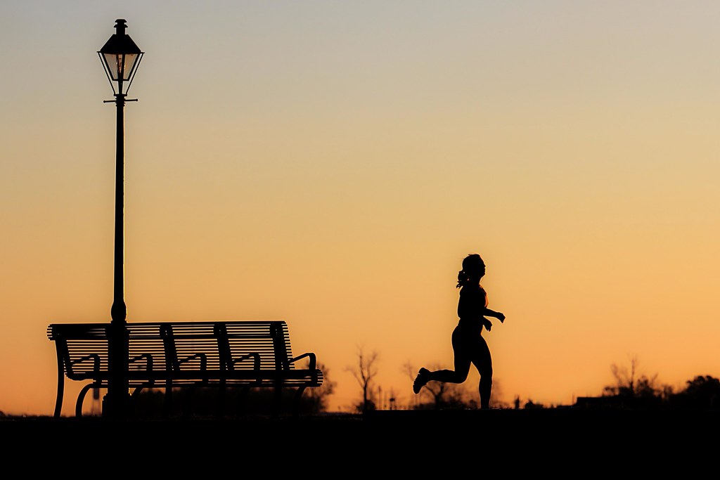
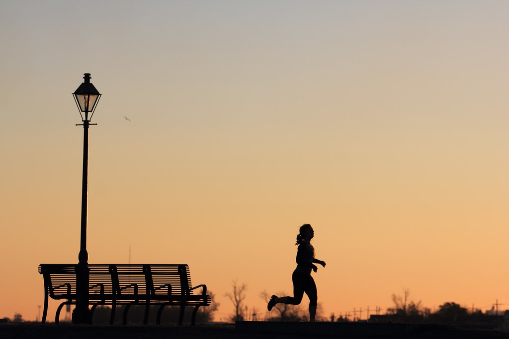
There does seem to be some artifact (whether it be from sharpening or some other reason) alongside the right side of the lamppost. There appears to be CA on the right edges of the runner.
I find the crop ratio a little "not right" to me. It isn't square nor 4 x 6 or even 8 x 10. It just feels wrong to me, but I would be interested in how others find it.
I find the small pin points of light coming from where the buildings are, a little off putting.
I really like the image though and will try to have another look later.


 Reply With Quote
 )
)


Bookmarks